
How to Improve Website Conversion Rates
To get more website conversions, you have to get inside your visitors' heads. It’s a three-part dance: figure out what they’re doing, smooth out the rough spots in their journey, and then test everything obsessively.
Think of it this way: you can't just start painting a house without prepping the walls first. You'd end up with a mess. Same goes for conversion optimization.
Building Your Foundation for Higher Conversions
Before you get lost in the weeds testing button colors or rewriting headlines, you need a solid foundation. Jumping into optimization without knowing the basics is like trying to navigate a new city without a map—you might get lucky, but you’ll probably just end up lost and frustrated.
So, let's build that foundation. It all starts with defining your goals, getting your tools in order, and knowing what the heck you’re measuring.
A "conversion" isn't some universal term. For an ecommerce store, it’s a sale. Easy. For a B2B software company, it might be a demo request or a free trial signup. For a content creator, it could be as simple as a newsletter subscription. You have to be crystal clear on what actions matter most.
I like to break them down into two buckets:
- Macro-conversions: This is the big kahuna, the main goal of your website. Think completing a purchase or signing up for a paid plan.
- Micro-conversions: These are the smaller, crucial steps a user takes on the way to that main goal. We’re talking about adding an item to the cart, watching a product video, or downloading a case study.
Tracking both gives you a much richer picture of what’s actually happening. You can pinpoint exactly where potential customers are dropping off, which is gold. For a deeper dive, check out our guide on what a conversion rate in marketing truly means.
Setting Realistic Benchmarks
It’s tempting to aim for a 10% conversion rate right out of the gate, but goals need to be grounded in reality. Performance varies wildly depending on your industry, traffic source, and even the device your visitors are using. Chasing some generic number is a recipe for disappointment.
For instance, the global eCommerce conversion rate often hovers between 2% and 4%, but that average hides a ton of variation. Personal care products can see conversion rates as high as 6.8%, while home decor might only hit 1.4%. Why? One involves frequent, low-cost buys, while the other requires a lot more thought.
Here’s another one: desktop users convert at a rate of 4.8%, much higher than mobile's 2.9%—even though mobile drives most of the traffic! This just hammers home the need for industry-specific, device-optimized strategies.
Before you start optimizing, it’s mission-critical to track the right metrics to diagnose what’s broken. Here are the absolute must-haves.
Key Website Metrics to Start Tracking Now
| Conversion Rate | The percentage of visitors completing a desired goal (e.g., purchase, sign-up). | Google Analytics 4 |
|---|---|---|
| Bounce Rate | The percentage of visitors who leave after viewing only one page. High rates can signal a mismatch between your ads and your landing page. | Google Analytics 4 |
| Average Session Duration | How long visitors stick around. Longer sessions can indicate higher engagement. | Google Analytics 4 |
| Pages per Session | The average number of pages a user views. More pages can mean deeper interest, or it could mean they can't find what they're looking for. | Google Analytics 4 |
| Click-Through Rate (CTR) | For ads and on-site CTAs, this shows how compelling your copy and design are. | Google Analytics 4, Ad Platforms |
| Scroll Depth | How far down the page users are scrolling. It tells you if your most important content is even being seen. | Hotjar, Crazy Egg |
| Rage Clicks | When a user repeatedly clicks on an element that isn't clickable. It's a direct signal of user frustration. | Hotjar, Crazy Egg |
Getting these basics in place will give you a clear baseline. You’ll know what’s working, what’s not, and where the biggest opportunities are hiding.
Equipping Your Toolkit for Success
You can't improve what you don't measure. Guesswork has no place in conversion optimization; every decision should be backed by cold, hard data. Setting up the right tools is non-negotiable.
Here are the absolute essentials you need in your arsenal:
- Google Analytics 4 (GA4): This is your source of truth for quantitative data. It tells you what is happening on your site—which pages get the most traffic, where users are dropping off, and your overall conversion rates.
- Heatmapping & Session Recording Software: Tools like Hotjar or Crazy Egg provide the qualitative story. They show you why things are happening. Heatmaps reveal where users click and scroll, while session recordings let you watch anonymized user journeys to spot friction points in real-time.
Sometimes, a quick win comes from simply being there to help. For example, implementing a Live Chat for Sales feature can give you immediate user feedback and support, directly impacting your bottom line by answering questions at the exact moment of hesitation.
Your data tells a story about your users' frustrations and desires. Your job is to listen carefully to that story and then rewrite the ending to be a conversion.
Finding and Fixing Conversion Blockers

Your website is whispering clues about why people bail without buying. The problem isn’t a lack of data; it’s that most of us don’t know how to listen. If you really want to move the needle on conversions, you have to become a digital detective and find the hidden friction points that are quietly killing your sales.
Think of it this way: your quantitative tools, like Google Analytics, are great at showing you what is happening. They'll tell you that your checkout page has a sky-high exit rate. But they won’t tell you why. That's where qualitative tools come in—they uncover the human behavior behind the numbers.
Uncovering User Behavior with Heatmaps
Heatmaps are easily one of the most powerful diagnostic tools you can get your hands on. They give you a visual, color-coded map showing exactly where people click, move their mouse, and scroll on any given page. Instead of getting lost in a spreadsheet, you get an instant, intuitive picture of user engagement.
Let's say you just launched a new landing page. Analytics shows a gnarly bounce rate, but offers no clues as to why. A heatmap could immediately show you that 70% of visitors are clicking on a beautiful image that isn't actually a link, while completely ignoring your main call-to-action button right below it. That's not a guess—it’s a clear signal that your design is confusing people.
Heatmaps break down user behavior into a few key types:
- Click Maps: See exactly where users are clicking. Are they hammering your CTA, or are they distracted by non-clickable elements they think are buttons?
- Scroll Maps: Reveal how far down the page people actually go. If your best offer is buried below the average fold, guess what? Most people will never even see it.
- Move Maps: These track where users move their mouse, which is often a strong indicator of where their eyes are going. This helps you see which headlines or images are grabbing the most attention.
By analyzing these maps, you can spot usability problems in minutes and form smart, data-backed hypotheses for your next A/B test.
Watching Real User Journeys with Session Recordings
If heatmaps show you the "what" in aggregate, session recordings show you the "why" on an individual level. These are anonymized videos of real user visits, letting you watch their entire journey—every mouse movement, every click, every page they visit. It’s like looking over their shoulder as they try to navigate your site.
This is where you find the most painful, undeniable evidence of user frustration. You might watch someone try to add an item to their cart five times, only to be stopped by a tiny bug you never knew existed. Or you could see a visitor spend two minutes desperately searching for your shipping policy before giving up and bouncing forever.
Session recordings transform abstract data points into human stories. Seeing a real person struggle with your checkout form is far more motivating than just seeing a high abandonment rate in a report.
These recordings are gold for diagnosing issues that analytics alone can't explain. They expose broken links, confusing navigation, and all the little moments where the user experience just falls apart. Honestly, watching just five or six sessions from users who dropped off can give you a crystal-clear list of what you need to fix right now.
Gathering Direct Insights with User Feedback
Sometimes, the easiest way to find a conversion blocker is to just ask your users. Behavioral analytics are crucial, but they can't read a user's mind. When you combine analytics with direct feedback, you get the complete picture.
Here are a few dead-simple ways to collect this feedback:
On-Site Surveys: Pop up a small survey on pages with high exit rates. Ask a simple question like, "Was anything stopping you from making a purchase today?" The answers you get can be pure gold.
Post-Purchase Surveys: Ask recent customers what almost stopped them from buying. This can uncover friction points you need to address for future visitors.
Feedback Widgets: A simple, non-intrusive tab lets visitors report a problem or rate their experience on any page, giving you real-time insights as issues pop up.
By combining the visual data from heatmaps, the contextual stories from session recordings, and the direct voice of your customers, you can build a comprehensive hit list of conversion blockers. This is how you move from guesswork to a strategic, data-driven optimization process that actually works.
Crafting a Message That Converts

Alright, you've fixed the technical glitches and smoothed out the user experience. Now comes the real work. All the site speed and slick design in the world won't matter if your message falls flat.
Your copy has to instantly connect with visitors and answer their one, unspoken question: "What's in it for me?"
A powerful, crystal-clear value proposition is often the single biggest lever you can pull for better conversions. It's not just a tagline; it’s the promise you make to your customers. And every word on your site, from the headline to the final call to action, needs to deliver on that promise.
This is where you stop fixing problems and start creating desire.
Writing a Value Proposition That Sticks
Your value proposition needs to be the very first thing a visitor sees and understands. No exceptions. It should spell out the benefit you offer, who you help, and what makes you different from the other guys.
Ditch the jargon and corporate-speak. Aim for clarity and punch.
A great gut check is the classic "five-second test." Can a first-time visitor figure out what you do and why it matters within five seconds of landing on your page? If the answer is no, your message is too complicated.
For example, a project management tool could go from a feature-heavy headline like "Our Platform Has Gantt Charts and Kanban Boards" to a benefit-driven one: "The Easiest Way for Busy Teams to Manage Projects and Hit Deadlines." See how the second one speaks directly to a user's pain point and their desired outcome?
Key Takeaway: Your value proposition isn't about what your product is. It’s about what your product does for the customer. Focus on the outcome, not the features.
From Headlines to Body Copy That Persuades
Your headline has one job and one job only: to get the user to read the next sentence. It must be compelling, benefit-focused, and perfectly aligned with why they clicked in the first place. If someone clicks an ad for "custom leather dog collars," your headline better scream exactly that.
The body copy is there to back up the headline's promise. This is where you build your case using short, scannable paragraphs and language that always circles back to the benefit.
Instead of this: "Our software uses an advanced algorithm..."
Try this: "Our software saves you 10 hours a week by automating your reports..."
The difference is night and day. The first describes a feature; the second paints a picture of a tangible benefit that resonates with a busy professional. Your goal is to show them what a better future looks like, all thanks to what you offer.
Building Trust with Social Proof
Let's be real: people are skeptical online. Before they hand over their email or credit card number, they need to trust you. Social proof is your secret weapon here—it's the digital equivalent of a friend's recommendation.
Here are a few powerful forms of social proof you should be weaving into your messaging:
- Customer Testimonials: Use direct quotes from happy customers. For maximum credibility, include their name, photo, and company. A quote like, "This service doubled our leads in three months," is infinitely more powerful than you saying it yourself.
- Case Studies: These are in-depth stories showing how you solved a specific problem for a client, complete with data and results. They're absolute gold for B2B businesses with longer sales cycles.
- Ratings and Reviews: Star ratings on product pages are non-negotiable for eCommerce. One study found that products with reviews have a 12.5% higher conversion rate. Enough said.
- Trust Badges and Logos: Displaying logos of well-known clients or security badges (like Norton or McAfee) can provide an instant credibility boost.
Tailoring Your Message for Different Traffic Sources
Not all visitors are created equal. Someone arriving from a targeted Facebook ad has totally different expectations than someone who found you through an organic search for a specific problem. Your messaging needs to reflect that.
This is where understanding channel-specific conversion rates is vital. For instance, direct traffic typically has the highest average conversion rate at 3.3% because these visitors already know your brand. Email marketing is close behind at 2.8%, capitalizing on a warm audience. SEO brings in users with high intent, converting around 2.3%, while paid channels often have lower rates. You can explore more on how these conversion benchmarks differ by channel for deeper insights.
To take advantage of this, create a consistent "scent" from the ad or link straight to the landing page. If your ad promises a "50% off winter sale," your landing page headline must echo that offer loud and clear. This alignment cuts down on confusion, reassures the visitor they're in the right place, and makes them far more likely to convert.
Designing a Seamless User Journey
Once your messaging is dialed in, it's time to look at the path visitors take on your site. A clunky, slow, or confusing user journey will kill a potential sale faster than just about anything else. Your mission is to hunt down and eliminate every point of friction, making the trip from curious visitor to happy customer feel effortless.
This is about more than just pretty design. It’s about the psychology of how people move through a digital space. Every single element—from how fast your page loads to the color of your buttons—nudges them closer to converting or closer to leaving.
The Critical Impact of Site Speed
Let's be real: nobody waits for slow websites anymore. Page speed isn't just a techy metric; it’s a direct signal of how much you respect your visitor's time. We've seen a mere 0.1-second improvement in load time boost conversions by over 8% for e-commerce sites. That's not a small number.
Slow load times are the silent killer of conversions. If your site takes more than a couple of seconds to pop up, you're bleeding potential customers before they even see what you offer. Tools like Google's PageSpeed Insights are non-negotiable for spotting what's bogging you down, whether it's massive image files or clunky code.
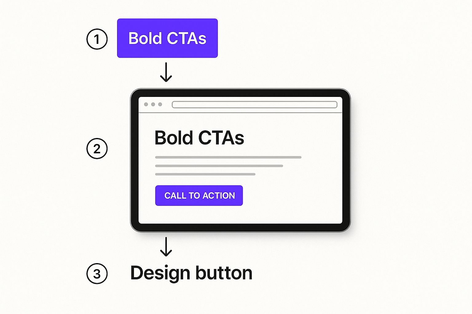
The image above nails it—bold, strategically placed Calls to Action are the backbone of a user journey that actually works. The visual hierarchy here makes it dead simple for a user to know exactly what to do next.
Mastering Your Call to Action
Your Call to Action (CTA) is the single most important element on the page. It’s the final bridge between interest and action. A weak, vague, or hidden CTA means all your other hard work was for nothing.
Crafting a CTA that works is both an art and a science. Here’s what matters:
- Color and Contrast: The button needs to pop. Use a color that stands out from the background but still fits your brand. You want it to be the most obvious thing on the screen.
- Action-Oriented Language: Ditch the generic "Submit." Use strong, clear verbs that tell the user exactly what they're getting. "Get Your Free Quote" crushes a passive button every single time.
- Strategic Placement: Put your main CTA "above the fold" where nobody can miss it. On longer pages, don't be shy about repeating it at logical points. The user should never have to scroll around hunting for it.
Think of your CTA as a confident direction, not a timid suggestion. The design and copy should leave zero doubt about the next step you want the user to take.
Eliminating Checkout and Form Friction
The checkout process is the final hurdle, and it’s where a shocking number of sales go to die. Every extra field, every confusing step, every second of hesitation massively increases the chance of cart abandonment. This is your biggest opportunity for a quick win.
Watch out for these classic conversion killers:
- Forced Account Creation: Making someone create an account just to buy something is a legendary mistake. Always, always offer a guest checkout option.
- Long, Complicated Forms: Only ask for what you absolutely need to process the order. Use tools like address autofill and make sure your error messages are crystal clear.
- Hidden Costs: Nothing makes people abandon a cart faster than a surprise shipping fee or tax on the final screen. Be transparent about all costs from the very beginning.
Historical data shows the average e-commerce conversion rate in the US is around 2.58%. If you're on a platform like Shopify, that number often dips closer to 1.4%. Knowing these benchmarks helps you set realistic goals for your own site.
But what happens when someone leaves your site without converting? It’s not over. Bringing them back is often cheaper and more effective than finding a new customer. You can learn more about how to do this by exploring what is retargeting advertising and how it turns missed opportunities into sales.
Building a Culture of Non-Stop Improvement
Look, improving your website’s conversion rate isn't a project you finish. It’s not a task to check off the to-do list. The second you stop testing and learning is the second your growth hits a wall.
The sharpest businesses out there treat conversion rate optimization (CRO) as a core part of their culture—a continuous cycle of improvement. This shift in thinking takes you from making random, gut-feel tweaks to building a data-driven engine for consistent, long-term growth. It's all about creating a powerful feedback loop where the insights from one test feed the brilliant idea for the next one.
That’s how you get those sweet, sweet incremental gains that compound over time.
Let's Clear the Air on A/B Testing
At the very heart of this continuous improvement mindset is A/B testing, or split testing. The concept is beautifully simple: you create two versions of a webpage. Version "A" is your original (the control), and version "B" has one single change. You show these versions to different segments of your audience at the same time and track which one gets more conversions.
Boom. The data gives you a clear winner.
This simple process pulls guesswork and ego out of the equation. No more boardroom debates over whether the green button is "better" than the orange one. You let your users vote with their clicks. A solid A/B testing program isn't random—it's a structured process that starts with a killer hypothesis and ends with data you can actually trust.
It All Starts With a Strong Hypothesis
Every single test needs to kick off with a clear, testable hypothesis. A flimsy idea like, "Changing the button color might increase clicks," is basically useless. Why? It lacks a reason. There’s no "because."
A strong hypothesis follows a simple but powerful structure: "If I change [X], then [Y] will happen, because [Z]."
Let's walk through a real-world scenario. You're watching session recordings and notice people are hovering on your pricing page, then bouncing. You suspect the value just isn't punching them in the face hard enough.
- Your hypothesis: If we change the headline from "Our Pricing Plans" to "Find the Perfect Plan to Grow Your Business," then sign-ups will increase, because the new headline speaks directly to the user's goal and frames the price in terms of value, not cost.
See the difference? It's specific, you can measure it, and there's solid reasoning behind it. This gives your test a real purpose and makes the results—win or lose—incredibly easy to understand.
A well-crafted hypothesis turns a random idea into a strategic experiment. It ensures that whether you win or lose the test, you always learn something valuable about your audience.
So, What Should You Actually Test?
The number of things you could test is nearly infinite, and that can feel paralyzing. The secret is to prioritize tests based on their potential impact and how easy they are to implement. Start with your high-traffic pages—your homepage, key product pages, or the checkout flow. Small wins on these pages can deliver massive results.
Here are a few high-impact elements to get you started:
- Headlines and Value Propositions: This is your digital handshake. Test different angles. Do you lead with a benefit? Address a major pain point? Create a little FOMO?
- Calls to Action (CTAs): This is ground zero for CRO. Experiment with the text ("Get Started Free" vs. "Create Your Account"), color, size, and even the placement of your main buttons.
- Page Layout and Design: Try shuffling the deck. What happens if you move your glowing customer testimonials higher up the page? Does it build trust earlier and keep people moving forward?
- Form Fields: The classic CRO test for a reason. Reducing the number of fields in a sign-up form almost always works. Find out if asking for a phone number is a deal-breaker for your audience. Test it.
To run these kinds of controlled experiments, you’re going to need the right software. Spend some time exploring different conversion rate optimization tools to find a platform that matches your team's skill level and budget. The right tool will make managing tests and digging through the results a whole lot easier.
To help you figure out where to start, you need a way to rank your ideas. Don't just throw spaghetti at the wall.
A/B Testing Idea Prioritization Framework
Use this simple framework to decide which tests to run first for maximum impact with the least amount of heavy lifting. Score each idea from 1 (low) to 5 (high) for Impact and Ease, then multiply them to get your priority score. Tackle the highest scores first.
| Change homepage headline | 5 | 5 | 25 |
|---|---|---|---|
| Test a new CTA button color | 3 | 5 | 15 |
| Remove 2 fields from lead form | 4 | 4 | 16 |
| Redesign the entire product page | 5 | 1 | 5 |
| Move testimonials above the fold | 4 | 3 | 12 |
This isn't rocket science, but it forces you to be strategic. The goal isn't just to test, it's to get meaningful wins as quickly as possible. The full product page redesign might be a great idea, but it’s a huge effort for later. That headline change? You could probably knock that out this afternoon.
"Is This Real?" Understanding Statistical Significance
Okay, so you ran a test and one version got more clicks. Awesome. But how do you know it wasn't just a fluke? A random bit of luck?
This is where statistical significance enters the chat.
In plain English, it's a measure of how confident you can be in your results. A significance level of 95% means there’s only a 5% chance that the difference you saw was due to random noise. Most testing tools will calculate this for you, but the important part is being patient. You have to wait until you hit that threshold before you pop the champagne and declare a winner.
Calling a test too early based on a tiny sample size is one of the biggest rookie mistakes. It can lead you to make business decisions based on faulty data, which can undo all your hard work. Let the test run its course.
Got Questions About Conversion Rate Optimization? We've Got Answers.
Jumping into conversion rate optimization always kicks up a few questions. You get the 'what' and the 'why,' but the 'how much' and 'how soon' can feel a little fuzzy. Let's clear the air on the most common things people ask so you can set some real-world expectations.
One of the first things everyone wants to know is how long it takes to see actual results. The honest answer? It depends. A simple A/B test on a page that gets a ton of traffic—say, changing a headline or a CTA button color—might give you a clear winner in just a couple of weeks.
But for bigger moves, like a full overhaul of your checkout process, you'll need more time to build it out and gather enough data. The real secret is to think of CRO as a marathon, not a sprint. It’s the consistent, step-by-step testing that builds momentum and delivers those huge long-term wins.
What Kind of Budget Are We Talking About?
The next big question is always about the money. CRO costs can scale like crazy, from practically free to a major line item in your marketing budget. You can absolutely start lean by using free tools like Google Analytics to find opportunities and run simple tests yourself.
As you get more serious, you might decide to invest in premium software for more advanced heatmapping, session recordings, and A/B testing. The budget spectrum usually breaks down like this:
- The DIY Route: This is mostly an investment of your time. You’re using free tools to dig through data and make changes you can handle in-house.
- Software Investment: This can run anywhere from $50 to $500+ a month for specialized CRO platforms that make data collection and testing way easier.
- Hiring an Agency: Bringing in the pros can cost several thousand dollars a month, but you're paying for a dedicated team with specialized skills.
The right budget really comes down to what you can afford and how complex your site is. The good news is that even small, focused efforts can deliver a surprisingly strong ROI.
The most effective CRO programs don't just throw money at problems. They start by identifying the biggest opportunities for improvement and strategically allocate resources to tackle those first, ensuring every dollar spent is aimed at driving measurable growth.
Okay, So Where Do I Even Start?
When you're new to this, the sheer number of things you could optimize can feel paralyzing. The best place to begin is always where you can make the biggest impact with the least amount of effort. In other words, go for the low-hanging fruit.
Pull up your analytics and find your highest-traffic pages that have the worst conversion rates. Maybe it’s a popular product page with a sky-high bounce rate or a landing page that just isn't getting any sign-ups. Fixing the leaks in your biggest buckets will always deliver the fastest results.
For a broader look at different approaches you can take, digging into some top strategies to improve website conversion rates can help you build out a solid game plan from day one.
At Rebus, we turn these questions into actionable strategies. Our team of experts uses a data-driven approach to find and fix conversion blockers, crafting seamless user journeys that turn visitors into loyal customers. If you're ready to stop guessing and start growing, partner with us to unlock your website's true potential. Learn more at https://rebusadvertising.com.