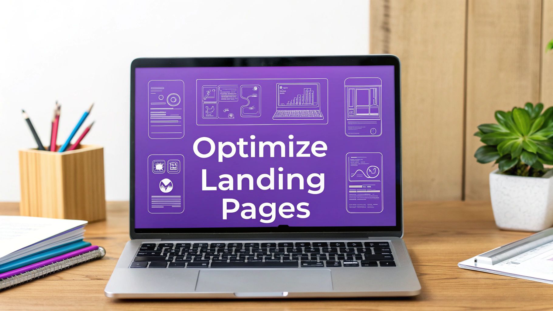
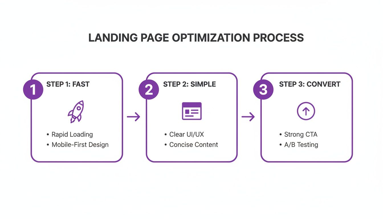
How to Optimize Landing Pages for Maximum Conversions
If you want to optimize a landing page, every single element—from the headline down to the call-to-action—has to be obsessed with one thing: a single conversion goal. It's a game of alignment, making sure your ad copy syncs up with your page content, designing an experience that feels effortless, and then testing everything to squeeze out better performance.
The guiding rule? Kill all distractions. Guide the user to do that one specific thing you want them to do.
Establishing Your High-Conversion Foundation
Before you start messing with button colors or A/B testing headlines, you need to pour a solid foundation. A landing page that actually converts isn't just a pretty design; it’s a purpose-built machine engineered for one objective. This laser focus is what separates it from your homepage.
Think of your homepage as the front desk of your business. It’s got links everywhere, pointing visitors to different departments like "About Us," "Blog," or "Services." It has to serve everyone.
A landing page, on the other hand, is a specialist's office. It’s built for a specific campaign and has one job to do—capture an email, book a demo, or sell a product. End of story.
The Critical Role of Message Match
One of the fastest ways to kill your conversion rate is a disconnect between your ad and your landing page. This is where message match becomes your best friend. If someone clicks an ad promising a "50% Discount on Winter Coats," the page they land on better scream that exact offer in the headline and hero image.
Any wobble in consistency creates friction and confusion, sending visitors straight to the back button. For example, if your ad shows a blue coat but the landing page features a red one, you've already planted a seed of doubt. Perfect message match creates a smooth, reassuring path from the first click to the final conversion.
A landing page isn't an island; it's a critical stop on a much larger user journey. Its whole purpose is to deliver on the promise made by whatever brought the visitor there—whether that was a paid ad, an email link, or a social media post.
Setting Your Baseline for Success
You can't optimize what you don't measure. Before you dive headfirst into testing, you have to establish your baseline metrics. These initial numbers are the benchmark you’ll judge all future tweaks against.
Here are the key metrics to lock down first:
- Conversion Rate: The percentage of visitors who actually do the thing you want them to do.
- Bounce Rate: The percentage of visitors who take one look and leave.
- Time on Page: How long people are sticking around, which can signal engagement (or confusion).
- Form Submission Rate: For lead gen pages, this is the percentage of people who start and finish your form.
Understanding these numbers is the first step to diagnosing what’s broken and spotting opportunities. To really get this right, you need to see how your landing pages fit into the broader strategy of building high-converting sales funnels.
Each page is just one step on a carefully crafted path. You can get a full breakdown of that journey in our guide on what a conversion funnel is: https://rebusadvertising.com/blogs/what-is-conversion-funnel/. With a clear goal and solid metrics, you're finally ready to build pages that actually work.
Before we dive into the nitty-gritty tactics, let's zoom out. Optimizing a landing page isn't about one magic bullet; it's about systematically improving a few core areas that work together to persuade a visitor to act.
Core Pillars of Landing Page Optimization
| Audience & Offer | Ensure the page speaks directly to the right person with an irresistible value proposition. | User personas, pain points, unique selling proposition (USP), message match. |
|---|---|---|
| Design & UX | Create a frictionless, intuitive, and visually compelling experience that guides the user. | Layout, visual hierarchy, mobile responsiveness, readability, trust signals. |
| Copy & Persuasion | Use words to build trust, create desire, and clearly communicate the benefits of converting. | Headline, subheadings, body copy, social proof, call-to-action (CTA). |
| Technical Performance | Remove any technical barriers that could cause frustration and lead to abandonment. | Page speed, image optimization, browser compatibility, form functionality. |
Think of these pillars as the foundation of your house. If one is weak, the whole structure is at risk of collapsing, no matter how great the others are. Mastering each is key to building pages that consistently perform.
Crafting Copy That Converts and CTAs That Compel
A slick design might get people to look, but it’s your words that get them to act. The copy is the engine of your landing page—it’s what guides a mildly curious visitor into becoming a decisive customer.
This isn't about stuffing your page with buzzwords. It’s about tapping into your visitor's real-world problem and positioning your offer as the clearest, most obvious solution. Every single word has to earn its spot on the page.
AIDA: An Old-School Framework That Still Kills It
The AIDA framework is a classic for one simple reason: it just works. It stands for Attention, Interest, Desire, and Action, giving you a powerful, no-nonsense structure for your landing page copy.
- Attention: Your headline's only job is to stop the scroll. It needs to instantly signal that the visitor is in the right place. Instead of a snooze-fest like "CRM Software," try a headline that hits a nerve: "Stop Juggling Spreadsheets. Manage Your Clients in One Place." See the difference?
- Interest: Okay, you've got their attention. Now you build interest with short, scannable paragraphs that scream "benefit." Forget listing features; tell them what those features do for them. Focus on the outcome.
- Desire: This is where you crank up the heat, turning casual interest into a real want. Slap some social proof on there—testimonials, case studies, or logos of clients they'll recognize. A quote from a happy customer dismantles skepticism faster than anything you can write yourself.
- Action: Finally, the grand finale: a clear, compelling Call-to-Action (CTA). If you’ve done your job, clicking that button should feel like the most natural next step in the world.
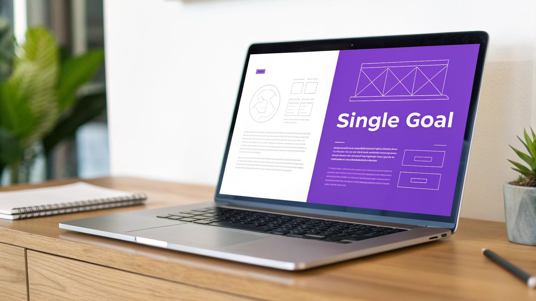
The Undeniable Power of a Single, Focused CTA
One of the most expensive mistakes you can make on a landing page is giving people too many options. When a visitor sees a buffet of links and buttons, they get decision paralysis and end up clicking nothing.
This is why the "one page, one goal" rule is non-negotiable for high-performing landing pages.
Every single element—the headline, the images, the copy—should funnel the user toward one conversion action. This singular focus makes the path forward crystal clear. The data backs this up, too. Research shows that pages with a single CTA convert around 13.5%, but pages with five or more links see conversion rates tank to about 10.5%. (You can dig into more landing page stats at Backlinko to see the full picture).
By ripping out your navigation menu, social media links, and any secondary offers, you eliminate all the escape routes. You create a closed loop where the only way out is through your primary CTA.
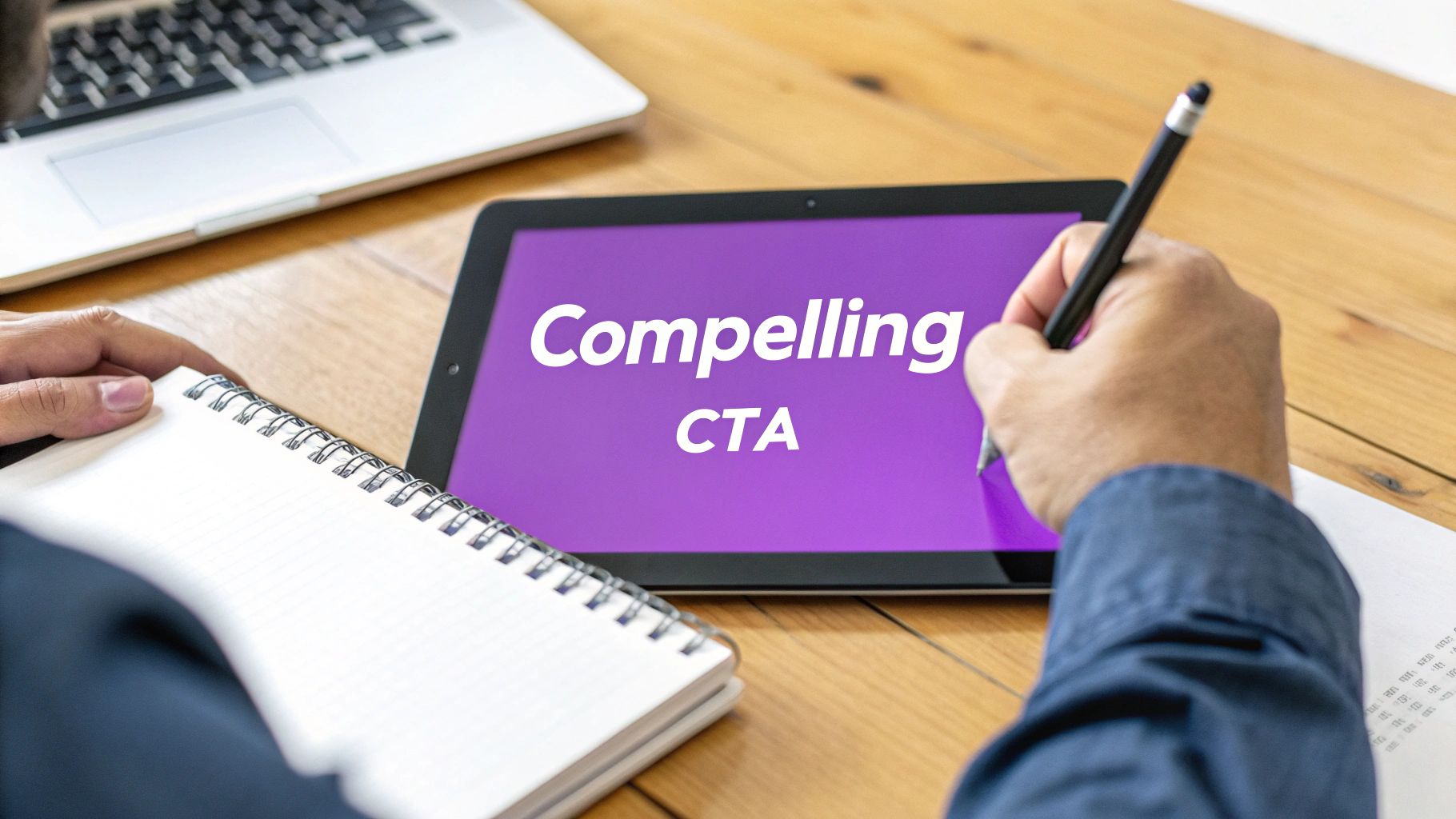
Designing CTAs That Are Impossible to Ignore
Your CTA button is the final gatekeeper to a conversion, so it deserves some serious thought. The goal is to make it pop visually and use language that lights a fire under the user.
Here’s how to create CTAs that demand a click:
- Use Action-Oriented Language: Kick off your CTA with a verb. "Submit" is dead. Try "Get Your Free Quote" or "Download My Guide." The copy should be specific and focus on what the user gets.
- Create Urgency (Without Being Sleazy): Phrases like "Claim Your Spot Now" or "Get Instant Access" give a gentle nudge to act now. Limited-time offers can work wonders, but only if they’re genuine.
- Pick a Contrasting Color: Your CTA button needs to be the loudest thing on the page. Choose a color that stands out from the background and makes the user's eye go straight to it.
- Size and Placement Matter: The button needs to be big enough to tap easily, especially on a phone. Placing it "above the fold" is standard advice, but for longer pages, don't be afraid to repeat the CTA further down. You never know when the impulse to convert will strike.
Designing an Intuitive and Persuasive User Experience
Great design isn’t just about looking slick; it’s about making things dead simple for your user. The best landing pages feel effortless, guiding a visitor from their first glance to the final click without them even realizing they're being led. That’s the whole game of a persuasive user experience (UX)—you strip away the friction and make the next step the most obvious choice on the page.
If someone lands on your page and feels even a flicker of confusion, they're gone. They won't stick around to figure out your clever layout. A killer UX design is like a silent tour guide, making sure your message is crystal clear, your value smacks them in the face, and your call-to-action is impossible to miss.
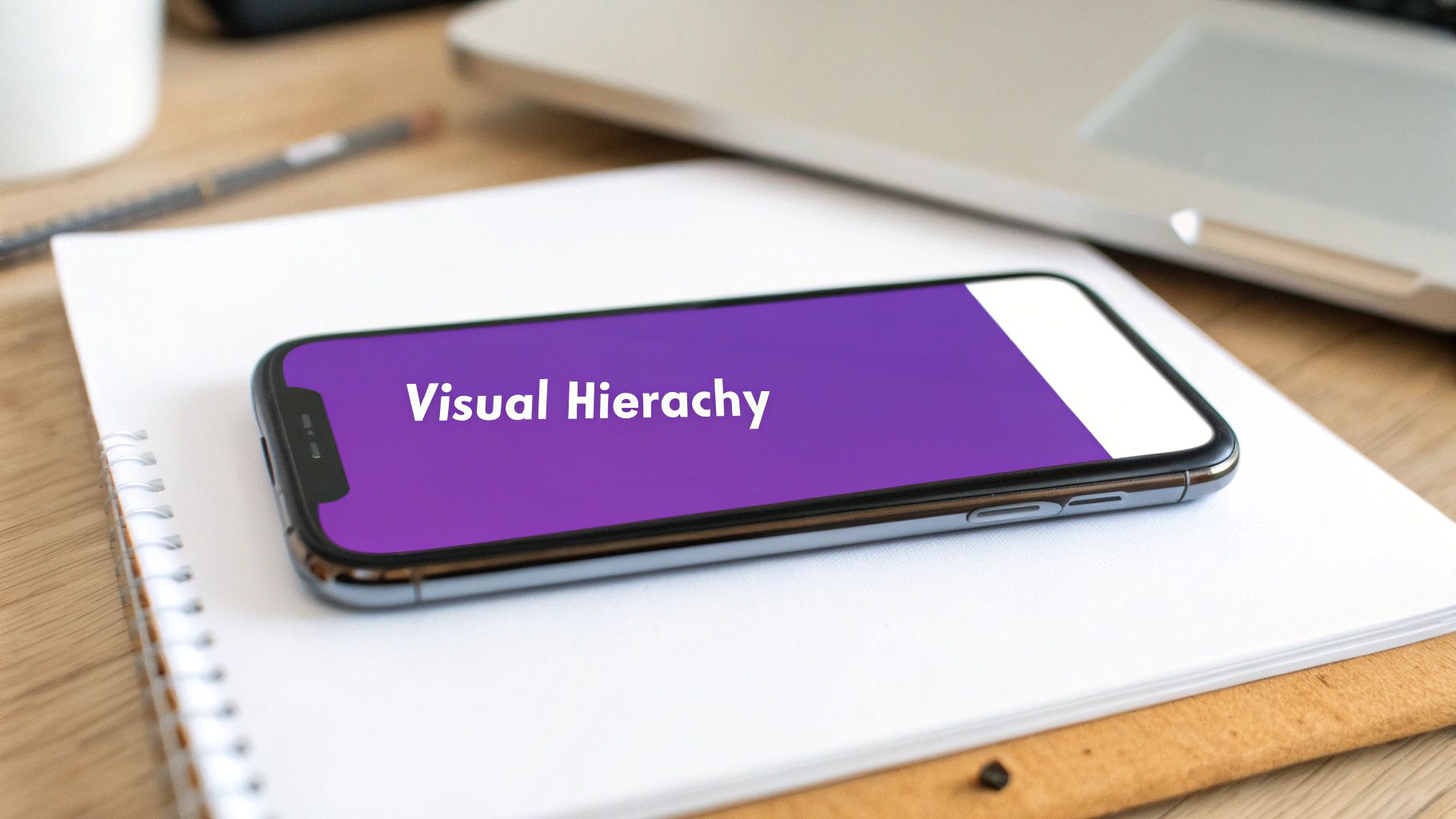
Establish a Clear Visual Hierarchy
Visual hierarchy is all about telling people where to look. You're intentionally using size, color, and placement to direct their eyes to the most important elements, in order. Your headline needs to be the biggest, boldest thing on the screen. Your CTA button should pop with a can't-miss color.
Think of it as the five-second test. Can a new visitor figure out what you do and what action they should take within five seconds? If not, your visual hierarchy has failed. This concept is foundational, and you can dig deeper into its impact in various user experience design best practices.
To nail this, every single element needs a purpose. Less important info, like a privacy policy link, should be tiny and tucked away. Your key benefit statements? They need to be front and center, big and easy to read.
Use Whitespace to Your Advantage
One of the most powerful—and most criminally underused—design tools is whitespace. That's the empty space around your content. A cluttered page is a chaotic page, and it sends your visitor's brain into overload, making it impossible for them to focus on your core message.
Whitespace isn’t wasted space; it’s an active design element that makes your content more readable and your page feel calm and professional. It gives your headline, your form, and your CTA room to breathe, isolating them and making them the obvious focus.
A well-designed landing page uses whitespace to create focus. It’s like a spotlight on a stage, drawing all attention to the star performer—your call-to-action.
Harness High-Impact Imagery and Video
The right visual can get your message across faster and hit harder emotionally than a wall of text ever could. A sharp photo of your product being used or a quick video testimonial can forge an instant connection.
But here's the catch: it has to be relevant. Generic stock photos of smiling suits in a boardroom are useless. Your visuals need to support and amplify your copy, not just fill empty space.
A few quick tips for getting visuals right:
- Show, Don't Just Tell: Selling a physical product? Show it from every angle in a real-world setting. Offering a service? Use clean icons or a simple diagram to illustrate your process.
- Use Human Faces: We're hardwired to look at other faces. Images of your actual customers or team members can do wonders for building trust and making your brand feel real.
- Keep Video Short: If you use video, keep it under 60 seconds. The goal is to quickly hammer home your value and nudge the visitor toward the CTA, not to win an Oscar.
Follow Natural Reading Patterns
Let's be real: people don't read websites, they scan them. If you know the common scanning patterns, you can place your most important content right where they're already looking. The two big ones are the F-pattern and the Z-pattern.
- F-Pattern: For pages with a decent amount of text, users scan in an "F" shape. They read across the top, then down the left side, then across a second horizontal line. This makes the top and left of your page prime real estate.
- Z-Pattern: On simpler, less text-heavy pages, the eye often moves in a "Z" shape. This means you should place key elements along that path: logo in the top-left, secondary CTA or contact in the top-right, value prop slicing across the middle, and your main CTA in the bottom-right.
Beyond the aesthetics, applying the best design practices for websites to boost UX, accessibility, and conversions is non-negotiable for improving the entire journey. When you align your layout with these natural behaviors, you make it way easier for visitors to digest your information and find what they need, which dramatically boosts your conversion chances.
Don’t Let Clunky Forms and Slow Speeds Sabotage Your Conversions
Friction is the ultimate conversion killer. You can have the most persuasive copy and a jaw-dropping design, but if your form is a nightmare or your page takes forever to load, you’re dead in the water. These are the final hurdles where countless leads and customers bail out, so getting this part right is non-negotiable.
Think about it: a user who has decided to convert is fired up and ready to go. Their motivation is high, but their patience is razor-thin. A clunky form or a spinning loading icon is just enough to plant a seed of doubt and send them packing. Nailing these technical details is how you ensure a smooth finish to their journey.
Streamline Your Forms for Maximum Impact
The form is the finish line. It’s where a visitor commits. Your job is to make it as painless as humanly possible. Every extra field you add is another reason for them to bounce.
The golden rule? Only ask for what you absolutely need right now.
You can always circle back for more info later. For a simple ebook download, do you really need a phone number? Probably not. An email is enough to get the conversation started. On the other hand, a high-intent "Request a Demo" form is the perfect place to ask for more qualifying details like company size or specific challenges. Context is everything.
Every form field is a tiny transaction. You're asking for their personal info, and they're getting something of value in return. Keep the exchange fair, and you'll build the trust needed to get them to hit "submit."
Here are a few ways to get your forms in fighting shape:
- Slash the Number of Fields: This is the easiest win, period. Study after study confirms that fewer fields mean higher conversions. One legendary case study showed that cutting form fields from 11 to 4 cranked conversions up by a mind-blowing 120%.
- Use Smart Defaults and Autofill: Don't make people work. Pre-fill information for returning visitors and let browser autofill do the heavy lifting for everyone else. It’s a small touch that makes a huge difference.
- Label Fields Clearly: Always place labels above the input fields. Don't use placeholder text that vanishes the second someone clicks. That’s a surefire way to make users lose their place and get frustrated.
- Add Reassuring Microcopy: A quick line like, "We hate spam as much as you do," under the email field can instantly calm privacy fears. For a free trial, adding "No credit card required" near the submit button demolishes one of the biggest points of friction.
Boost Your Page Speed to Keep People Hooked
In our world of instant gratification, a slow landing page is a dead landing page. It's not an exaggeration. Even a one-second delay in page load time can slash your conversions by 7%. People expect pages to load almost instantly, especially on mobile, where connections can be spotty.
Page speed isn’t just a nice-to-have for user experience, either. It’s a major ranking factor for search engines like Google. A faster page gets shown to more people, and those people are far more likely to stick around. Your goal should be a load time under three seconds. Full stop.
A Practical Checklist for Faster Load Times
You don't need to be a coding wizard to make a big impact on your page's performance. Many of the most effective optimizations are surprisingly straightforward.
Here’s a quick-hit checklist to speed things up:
- Compress Your Images: This is culprit number one, almost every time. Massive, unoptimized images will bloat your page. Use tools like TinyPNG or ImageOptim to shrink file sizes without trashing the visual quality.
- Enable Browser Caching: This tells a visitor's browser to save static parts of your page—like your logo, CSS files, and images. The next time they visit, the page loads way faster because their browser already has all the pieces.
- Minimize HTTP Requests: Every single element on your page (every image, script, and stylesheet) requires a separate request to your server. Simplify your design. Combine CSS and JavaScript files, and be ruthless about cutting any third-party scripts or plugins that aren’t absolutely critical.
- Choose Quality Hosting: Your server's response time is foundational. If you’re trying to save a few bucks on a cheap, shared hosting plan, your speed will tank the moment you get a traffic spike. A reliable host isn't a cost; it's an investment in conversions.
By tackling both form friction and technical sluggishness, you're clearing the final barriers between your visitor and your conversion goal. This final polish is what makes all your hard work on copy and design actually pay off.
Implementing a Data-Driven A/B Testing Strategy
Let's get one thing straight: real landing page optimization isn't about guesswork or blindly ripping off a competitor’s design. It's a disciplined, scientific process fueled by data. A/B testing is the engine that drives this whole machine, moving you from hunches to hard evidence.
This methodical approach lets you test one change at a time—like one headline against another—to see which one actually resonates with your audience. Over time, these small, data-backed wins stack up to create massive improvements in your conversion rates.
From Guesswork to Hypothesis
The single biggest mistake I see marketers make is testing random ideas. Changing a button color from green to red just because you feel like it is a colossal waste of traffic. A powerful A/B testing strategy always starts with a strong hypothesis.
A hypothesis isn't just a guess; it's an educated statement based on what you already know about your users. You should be building it from data you've gathered from your analytics, heatmaps, or even direct customer feedback.
A solid hypothesis follows a simple framework: "If I change [X element], then [Y outcome] will happen, because [Z reason]."
- Real-World Example: "If we change the CTA from 'Submit' to 'Get My Free Guide,' then form submissions will increase, because the new copy focuses on the immediate value the user receives."
This structure forces you to justify every single test, ensuring you learn something valuable no matter the outcome. Every test—win or lose—should give you a new insight into what makes your audience tick.
Prioritizing Your Tests for Maximum Impact
You can test nearly anything on a landing page, from the headline down to the footer copyright date. But not all tests are created equal. You have to prioritize the ones that have the potential for the biggest impact on your bottom line. Don't get bogged down testing tiny font size changes when your value proposition is weak.
A great way to do this is by using a framework like the PIE model to decide what to test first:
- Potential: How much of an improvement can you realistically expect? A completely new headline has far higher potential than a small icon swap.
- Importance: How valuable is the traffic to this specific page? Focus your A-game on high-traffic, high-value pages first.
- Ease: How quickly and easily can you get this test up and running? Start with low-effort, high-potential tests to build momentum and get some early wins.
This process is all about focusing on what moves the needle—speed, simplicity, and conversion.
The key takeaway here is that optimization is a continuous cycle. Every element contributes to a faster, more intuitive experience that ultimately gets more people to convert.
Understanding Statistical Significance
This is where a lot of well-intentioned marketers trip up. Just because one version gets a few more clicks after a single day doesn't mean you have a winner. You absolutely must run your test long enough to reach statistical significance—that’s the mathematical confidence that your result isn't just a fluke.
Most A/B testing tools like VWO or Optimizely will calculate this for you, typically aiming for a 95% confidence level. In plain English, this means there's a 95% chance that the results are real and you could repeat them.
Declaring a winner too early is one of the most critical—and common—errors in A/B testing. Let the test run its course until it hits significance, even if it feels like one version is pulling way ahead. Patience is how you gather reliable, actionable data.
Once you have a clear winner, don't just pop the champagne and stop. Implement the winning variation and then start the process all over again with your next hypothesis. This creates a powerful cycle of continuous improvement. Keeping track of these results is crucial, and a deep dive into setting up goals in Google Analytics can provide the framework you need to measure success accurately.
High-Impact A/B Test Ideas to Get You Started
Feeling the itch to start testing? Good. Here’s a rundown of some practical test ideas that often deliver significant results. Think of this as your starting playbook.
| Headline / Value Prop | Benefit-focused ("Double Your Leads") | Pain-point focused ("Tired of Wasting Ad Spend?") | High |
|---|---|---|---|
| Call-to-Action (CTA) | Generic ("Submit") | Value-oriented ("Get My Free Guide") | High |
| Hero Section Media | Static image of the product | Short video demo or customer testimonial | Medium-High |
| Form Layout | All fields visible at once | A multi-step form breaking fields into stages | Medium |
| Social Proof | A row of client logos | A specific, impactful customer quote with a headshot | Medium-High |
| Page Layout | Long-form, single-column page | A two-column layout with a sticky form on the side | High |
This table just scratches the surface, but it highlights how you can move from simple copy tweaks to more ambitious layout changes.
By consistently running disciplined tests, you build an unshakeable understanding of what truly motivates your audience to click, sign up, and convert. This is how you stop guessing and start building landing pages that win.
Your Burning Questions, Answered
Even the best-laid plans hit a snag. When you're deep in the weeds of landing page optimization, a few common questions always seem to pop up. Let's tackle them head-on, so you can get back to boosting those numbers.
How Many Form Fields Should I Really Have?
Ah, the eternal debate. The short answer? As few as humanly possible.
Think about it from the user's perspective. If you're just signing up for a newsletter, an email is all you need. Period. If you're downloading a monster B2B whitepaper, then sure, asking for a name, email, and company feels fair. The key is to match the "ask" to the value of the "get."
Always start lean. You can test your way into adding more fields later if they're absolutely critical for qualifying leads. But let your A/B tests be the judge, not your sales team's wish list.
Don't just take my word for it. Data shows that slashing form fields from 11 down to 4 can jack up conversions by a staggering 120%. Less friction almost always means more action.
What’s a “Good” Conversion Rate, Anyway?
This is the million-dollar question, and the answer is… it depends. A "good" rate is a moving target that changes wildly based on your industry, traffic source, and what you're offering.
The average across all industries hovers around 9.7%, but that's just a vanity number. Top-tier pages can easily smash 30%. The finance industry might see 5% as a win, while some service-based businesses pull in over 18%.
Stop obsessing over universal benchmarks. Your real job is to establish your own baseline and then relentlessly beat it. The only number that truly matters is the one you're improving on.
Should I Slap a Video on My Landing Page?
Video can be an absolute conversion machine, sometimes boosting results by up to 86%. But—and this is a big but—execution is everything. A cheesy, irrelevant, or poorly produced video will send people running for the "back" button faster than you can say "low-budget."
If you're going to use video, you have to do it right:
- Keep It Short & Sweet: The video needs to be professional, to the point, and directly tied to what you're offering. Think product demos, punchy customer testimonials, or a quick explainer for a complex idea.
- Don't Be Annoying: For the love of all that is holy, autoplay on mute. Give users clear controls so they're in charge of the experience.
- Test Its True Impact: The only way to know if your video is a hero or a villain is to test it. Run a version of your page with the video against a version without it. The data never lies.
Sometimes, a killer hero image or a few lines of magnetic copy will outperform a video. Let your audience tell you what they prefer.
Ready to stop guessing and start building landing pages that actually work? At Rebus, we live and breathe this stuff. We mix data-driven strategy with killer creative to build experiences that don't just look good—they convert. Partner with us to supercharge your marketing and turn your brand's potential into results you can measure.