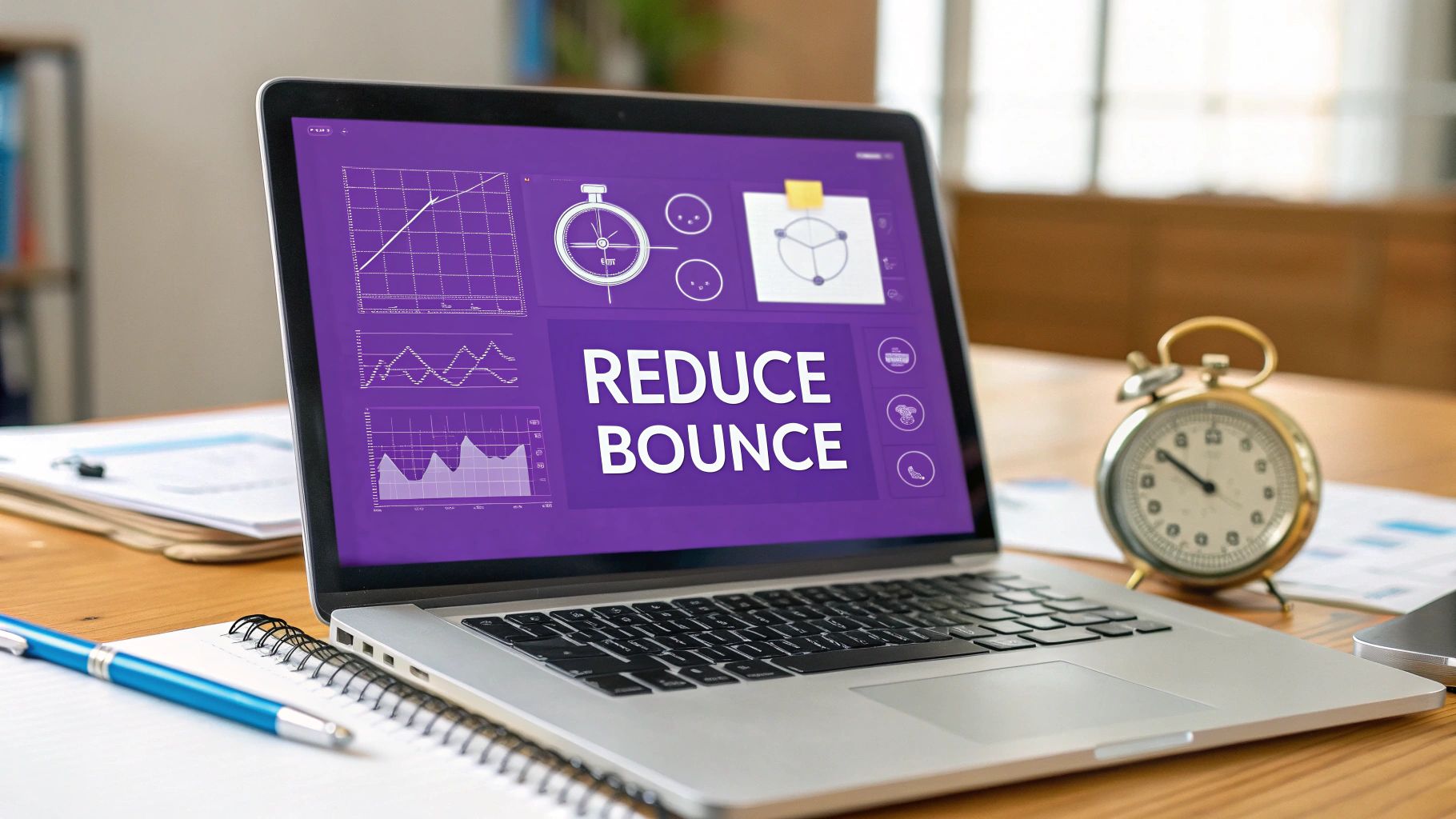
How to Reduce Bounce Rate and Keep Visitors Hooked
Alright, let's ditch the robotic fluff and get straight to what actually works. To slash your bounce rate, you've got to nail three things: site speed, user experience, and content relevance.
Think about it. A visitor lands on your page, and the clock starts ticking. If your site is slow, confusing to navigate, or the content misses the mark, they’re gone. Poof. Your job is to give them every reason to stick around, click, and explore.
Here’s a quick rundown of the core areas we'll be tackling. This table is your roadmap for turning bounces into engaged sessions.
Key Bounce Rate Reduction Strategies at a Glance
| Lightning-Fast Site Speed | Prevents frustration before it starts. | Optimize images, leverage browser caching, minify code. |
|---|---|---|
| Frictionless User Experience (UX) | Makes your site intuitive and enjoyable. | Simplify navigation, create clear calls-to-action, ensure mobile-friendliness. |
| On-Point Content Relevance | Delivers exactly what the user expects. | Align content with user intent, improve readability, use engaging visuals. |
Now that you have the big picture, let's dig into the nitty-gritty of why this all matters so much.
What Bounce Rate Is Really Telling You
Before you start tweaking code and rewriting headlines, let's get one thing straight. A "bounce" is when someone lands on a single page of your site and then leaves without doing anything else. No clicks, no form fills, no purchases. In Google Analytics terms, it's a single-page session.
This number is a raw, unfiltered signal of user engagement. A high bounce rate is often a red flag, screaming that visitors aren't finding what they came for, or worse, the page is actively pushing them away. But context is everything. Not all bounces are created equal, and knowing the difference is the secret to fixing the right problems.
The Good Bounce vs. The Bad Bounce
A "bad bounce" is the one that should keep you up at night. This is when someone leaves purely out of frustration. Maybe the page took an eternity to load, the navigation was a maze, or the content felt like a bait-and-switch from their Google search. These are the bounces you need to hunt down and eliminate.
On the flip side, a "good bounce" isn't a failure at all. Imagine someone searching for your phone number. They land on your contact page, grab the number, and leave. Mission accomplished, right? They found exactly what they needed instantly. In this case, the bounce is a sign of a successful, efficient visit. Your real job is to figure out which story your data is telling.
Key Takeaway: A bounce isn't just a visitor leaving; it's a story about their experience. Your goal is to eliminate bounces caused by frustration while understanding that some bounces are natural and even indicate a successful visit.
It's also crucial to know what’s “normal” for your industry. User expectations and behaviors vary wildly. For instance, gaming websites see an average bounce rate of 46.7%, while e-commerce sites hover around 45.68%. These benchmarks, which you can explore in this detailed statistical report, prove there's no magic one-size-fits-all number. What’s considered high for one niche might be perfectly acceptable for another.
Ultimately, a lower bounce rate is a strong sign of a healthy website. When people stick around longer, they're more likely to become customers. While they are separate metrics, a low bounce rate is often a leading indicator of a great conversion rate. You can learn more about how the two connect by exploring what conversion rate is in marketing.
Speed Up Your Website or Watch Visitors Walk Away
Let's be blunt: Nothing kills your traffic faster than a slow website. In a world where we get annoyed if our Netflix stream buffers for two seconds, expecting visitors to patiently wait for your page to load is a losing game. They won't wait. They’ll just hit the "back" button and give their attention to a competitor who gets it right.
This isn’t just a hunch; the numbers are brutal. Data shows that a site loading in one second sees a bounce rate of just 7%. Push that load time to a mere three seconds, and it jumps to 11%. At five seconds? A staggering 38% of your potential audience is already gone. The BBC even found that every extra second their site took to load cost them 10% of their users.
The message is clear: speed isn't a feature, it's a foundation. To get a handle on this, start with these expert strategies to optimize website performance and stop bleeding traffic.
First, Figure Out What's Actually Slowing You Down
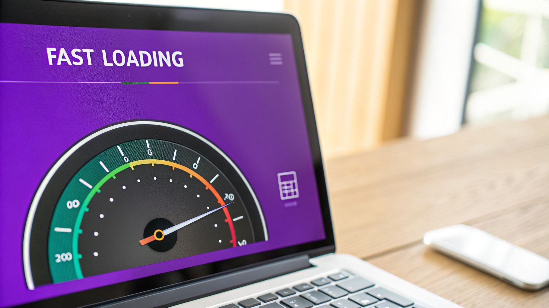
Before you start messing with code or installing a bunch of plugins, you need to diagnose the problem. Guessing is a great way to make things worse. You need a baseline, a report card that tells you exactly where you’re failing.
This is where a tool like Google’s PageSpeed Insights becomes your best friend. It’s free, it’s comprehensive, and it gives you a clear, actionable list of what to fix. Don’t get discouraged if your initial score is low—think of it as a treasure map showing you exactly where the gold is buried.
This graphic says it all. You can have the most brilliant content in the world, but if users bounce before it even loads, it’s completely worthless. Performance comes first.
Practical Fixes to Get Your Site Moving
Once you have your PageSpeed report, you can zero in on the biggest offenders. You’d be surprised how often a few key tweaks can deliver massive improvements. Here’s the low-hanging fruit to tackle right away.
Shrink Your Images
Massive, unoptimized images are the number one cause of sluggish websites, especially for blogs or e-commerce shops. That beautiful, high-resolution product shot might look great, but it could be costing you sales if it’s making people wait.
- Use Modern Formats: Ditch the old JPEGs and PNGs and convert your images to next-gen formats like WebP. They offer much smaller file sizes without any noticeable drop in quality.
- Compress Everything: Use a service like TinyPNG or a CMS plugin to automatically compress your images when you upload them. This process strips out useless data and makes the files way smaller.
- Turn on Lazy Loading: This is a clever trick that tells a visitor's browser to only load the images they can see on their screen. As they scroll down, the rest of the images load just in time. This makes that initial "above the fold" content appear almost instantly.
Use the Browser’s Memory (Caching)
Browser caching is a powerful way to reward returning visitors. The first time someone visits your site, their browser has to download all your assets—CSS files, JavaScript, logos, and images. Caching tells the browser to save a copy of these files.
When that user comes back, their browser just loads the files from its local memory instead of downloading them all over again. The result? A lightning-fast experience for your loyal audience.
Clean Up Your Code (Minification)
Your site’s code often contains things that humans need but browsers don’t, like comments, extra spaces, and line breaks. While helpful for developers, this clutter makes the files bigger than they need to be.
Minification is the process of automatically stripping all of that junk out.
The files become smaller and lighter, which means they download and process faster. A quicker site gives visitors less time to get impatient and bounce, simple as that.
A Real-Life Example: From Sluggish to Speedy
I once worked with an online store selling handmade leather goods. Their pages were gorgeous but absolutely choked with huge product photos. Their average load time was a painful 7.2 seconds, and their bounce rate was a devastating 65%.
After running a PageSpeed report, we did three simple things:
- We converted all their images from PNG to WebP.
- We installed a simple caching plugin.
- We flipped a switch in their settings to minify CSS and JavaScript.
The results were dramatic. Their load time dropped to 2.5 seconds, and their bounce rate plummeted to 35%. They didn't change a single product or a line of copy. They just made their site faster. It’s proof that performance isn’t just a technical detail—it’s a core part of the user experience you can’t afford to ignore.
Design a User Experience That Invites People to Stay Awhile
So, your site loads in the blink of an eye. Awesome. But even the fastest website on the planet will hemorrhage visitors if it’s confusing, clunky, or just plain frustrating to use. Once someone lands on your page, their very next move hinges entirely on how intuitive the experience feels.
A killer user experience (UX) isn't just about looking pretty. It's about making your site so effortless and enjoyable to navigate that leaving doesn't even cross their mind.
Think of your website like a physical store. If the aisles are a mess, the signs are gibberish, and you can't find what you’re looking for, you’re walking right back out. It’s no different online. In fact, a staggering 38.5% of visitors will bail on a site simply because the design feels outdated or unappealing.
Simplify Your Site Navigation (Like, Yesterday)
The single most critical piece of your UX is the navigation menu. It’s the map your visitors use to get around, and it needs to be crystal clear. When people can't find what they need in a few seconds, they don't dig deeper—they just leave.
A classic mistake is cramming the main menu with a dozen different options. This triggers "analysis paralysis," a fun little phenomenon where users get so overwhelmed by choices that they just give up and make no choice at all.
Here’s how to build a navigation structure that keeps people clicking:
- Stick to the Script: Put your navigation where people expect it—almost always at the top of the page. Don't try to reinvent the wheel with some artsy, unconventional layout that just confuses everyone.
- Use Obvious Labels: Ditch the clever jargon. Instead of "Solutions," call it "Our Services." Swap out "Insights" for "Blog." Clarity beats cleverness every single time.
- Keep It Lean: Aim for no more than seven main items in your navigation. If you’ve got more pages than that, group them logically under relevant dropdown menus.
This kind of simple, intuitive structure guides people where they want to go, encouraging them to click deeper into your site instead of heading for the exit.
Make Your Content Instantly Readable
Your content could be the most brilliant stuff ever written, but if it's a giant wall of tiny text, nobody is going to read it. Period. Readability is a cornerstone of good UX and plays a massive role in keeping people locked in.
Start with your fonts. A body font size of at least 16px is the modern standard for comfortable reading on screens. We actually use 18px here at Rebus just to make sure our articles are easy on the eyes. High contrast is also a must—dark text on a light background is the gold standard for a reason.
Pro Tip: Break it up. Seriously. Nobody wants to tackle a dense block of text. Use headings, subheadings, bullet points, and short paragraphs (like the ones you're reading now) to create visual breaks and make your content scannable.
Place Calls-to-Action That Guide the Journey
A page without a clear call-to-action (CTA) is a dead end. When a user finishes reading a blog post or checking out a product, they should know exactly what to do next. A well-placed CTA transforms a passive reader into an active participant.
Here’s a quick look at how good vs. bad CTA placement changes everything:
| No clear next step after the content. | A prominent "Read More" or "Shop Now" button is easy to spot. |
|---|---|
| CTAs are buried in the footer. | CTAs are placed within and at the end of the content. |
| Vague button text like "Submit." | Action-oriented text like "Get Your Free Quote." |
A great user experience turns every page into a stepping stone, not a final destination. By giving visitors a logical next step, you make it easy for them to continue their journey through your site. Nailing your CTAs is just one piece of the puzzle; you can find more strategies and helpful resources in our rundown of essential conversion rate optimization tools.
Matching Your Content to What Users Actually Want
The fastest way to get a user to bounce is to break a promise. You make that promise in the search results with your title and meta description. If someone clicks your link expecting an answer and lands on something totally different… poof. They’re gone.
This disconnect between what a user expects and what they get is a bounce rate killer. It all boils down to one critical concept: search intent.
You’ve got to figure out what someone is really trying to do when they type a query into Google. Are they looking to learn something? Buy something? Compare their options? Getting this right isn't just a good idea; it's the whole game.
Decode What Your Audience Is Really Searching For
Before you even think about writing, it’s time to play detective. The best clues are hiding in plain sight on the search engine results page (SERP). Just type your target keyword into Google and see what’s already ranking on page one.
Google’s whole job is to figure out what people want. The top results are a treasure map showing you exactly what kind of content makes users happy for that specific search.
- See a bunch of blog posts? That’s a clear signal for informational intent. People want a detailed guide, a list of tips, or a deep-dive explanation.
- Dominated by e-commerce product pages? That’s transactional intent. Users have their wallets out and want to see product specs, prices, and an "Add to Cart" button.
- Mostly review sites or comparison articles? This screams commercial or investigational intent. They’re weighing their options and aren't quite ready to pull the trigger.
By checking out the SERP before you create your content, you stop guessing what people want and start knowing what Google already rewards. This simple step can slash your bounce rate by making sure your page meets expectations from the very first click.
Craft Headlines and Meta Descriptions That Tell the Truth
Your headline and meta description are your billboard in the search results. They’re your first, and often only, chance to set expectations. If they’re misleading, you’re practically begging people to bounce.
Imagine searching for "best running shoes for beginners" and clicking a link that says "The Ultimate Guide to Beginner Running Shoes." But when you land on the page, it only sells one brand of super-expensive, professional-grade shoes. You’d feel tricked and hit the back button in a heartbeat.
The trick is to be compelling but brutally honest. Your title needs to grab attention, but your content has to deliver the goods. A sharp meta description can seal the deal by clarifying the page's value, giving users total confidence that your link is the right one. If you want to master this, our guide on how to write meta descriptions that convert is your next stop.
Structure Content for Scanners, Not Just Readers
Once a visitor lands on your page, you have mere seconds to convince them they’re in the right place. Here’s a tough pill to swallow: most people don’t read online. They scan.
A giant wall of text is an instant turn-off. It’s intimidating, and it’ll send users scrambling for the exit.
To keep them hooked, you have to structure your content for easy scanning.
- Use Clear Headings and Subheadings: Break your content into logical chunks with descriptive headings (just like in this article). This helps people jump straight to the info they need.
- Write Short Paragraphs: Seriously, keep them to two or three sentences max. The white space makes your content feel way more approachable.
- Lean on Bullet Points and Lists: Use lists to break down complex info, steps, or features into bite-sized, digestible nuggets.
This kind of structure isn’t just about looking pretty; it’s about respecting the user’s time. By making your content easy to consume, you encourage them to stick around, click around, and actually engage.
And the data doesn't lie. A deep dive into the world's most visited websites proves that low bounce rates go hand-in-hand with higher pages per visit. Take PayPal, which has a crazy-low desktop bounce rate of 19.5%. It's no coincidence that its users also visit an average of 7-8 pages per session. On the flip side, sites with sky-high bounce rates almost always see visitors leave after just one page—a total failure in engagement. This data from Reboot Online about user engagement confirms it: nailing that first page experience is the key to a longer, more valuable visit.
Fixing Technical Glitches That Drive Users Away
Nothing kills a user’s vibe faster than a website that feels janky. We’ve all been there—a link that goes nowhere, a pop-up you can't close, a page that just… won’t… load. These aren't just minor annoyances; they're trust-killers. They scream "unprofessional" and send potential customers running for the digital hills.
If you’re serious about lowering your bounce rate, stamping out these glitches is non-negotiable. It all starts with a proactive health check to find and fix the gremlins in the machine before they have a chance to scare anyone off.
Eradicating Broken Links and 404 Errors
One of the most jarring experiences for a user is hitting a dead end. They click a link, expecting juicy information, and instead get slapped with a "404 Not Found" page. It’s an immediate break in their journey and a clear signal to just hit the back button and try somewhere else.
Luckily, you can hunt these down for free using tools like Google Search Console. Dive into the "Pages" report, and you'll find a neat list of every URL serving up a 404 error. Checking this regularly lets you:
- Spot broken internal links: Find and fix links on your own pages pointing to content that no longer exists.
- Redirect old URLs: If you’ve moved or deleted a page, set up a 301 redirect. This tells browsers and search engines to send everyone to the new, correct location.
- Fix inbound linking errors: Sometimes another site links to a broken page of yours. You can either create a redirect or, if you're feeling ambitious, reach out and ask them to update the link.
Occasionally, you'll run into a more catastrophic problem. If your site completely crashes, you need to know how to resolve the dreaded White Screen of Death fast. Mastering this is crucial for keeping your site online and trustworthy.
Using Pop-Ups Without Driving People Crazy
Ah, pop-ups. They're a marketer's best friend and a user's worst enemy. Done right, they’re lead-generating machines. Done wrong, they’re an express ticket to a sky-high bounce rate—especially on mobile, where a rogue pop-up can hijack the entire screen.
The secret is to be respectful. A pop-up that ambushes someone the second they land on your site is just plain rude. Instead, get smarter with your triggers:
- Exit-Intent: This type of pop-up only appears when a user's cursor moves toward the browser bar, signaling they're about to leave. It's your last-ditch effort to offer something valuable—a discount, a free guide—without interrupting their flow.
- Scroll-Based: Trigger the pop-up only after a user has scrolled a good way down the page, maybe 50% or 75%. This way, you’re only engaging visitors who are already interested in what you have to say.
By making pop-ups a helpful, timely intervention rather than an immediate roadblock, you can capture leads without alienating the very audience you're trying to attract.
Ensuring a Flawless Mobile Experience
In this day and age, a clunky mobile website is a technical failure of the highest order. More than half of all web traffic now comes from mobile devices. If your site isn't optimized for small screens, you're actively turning away a massive chunk of your audience. Pinching and zooming to read text is a relic of the past.
A truly mobile-friendly site isn't just your desktop version shrunk down. It's a completely rethought experience that prioritizes readability and easy navigation on a touchscreen. Think large fonts, big buttons with plenty of space around them, and a simplified menu.
Want to see how your site measures up? Use Google’s free Mobile-Friendly Test tool.
This tool gives you a straight pass-or-fail verdict and points out specific problems, like text that’s too small to read or buttons that are too close together. Passing this test is a fundamental step toward building a solid technical foundation that won't cost you visitors.
Got Questions About Bounce Rate? You're Not Alone.
Even after you've tweaked your site speed, polished the UX, and aligned your content, some questions always seem to pop up. These are the "what-ifs" and nagging doubts that can keep you up at night. Let's tackle the big ones I hear all the time.
What’s a “Good” Bounce Rate, Anyway?
This is the million-dollar question, and the honest-to-goodness answer is: it depends. There’s no magic number that fits every website. Chasing a universal benchmark is a recipe for frustration.
A solid bounce rate for an e-commerce store might be anywhere from 20-45%. That makes sense, right? People are there to shop, so they're clicking around on different product pages.
But for a blog post? It could be 60-90%, and that's not necessarily a bad thing. If someone Googles a question, lands on your article, finds the perfect answer, and leaves satisfied—that's a win. They got what they came for.
Instead of obsessing over a specific number, focus on lowering your current bounce rate. It's about progress, not perfection. Watch for trends and aim to improve your own stats month over month.
Is a High Bounce Rate Tanking My SEO?
While Google's never come out and said, "Bounce rate is a top-three ranking factor," it’s one of those signals that just makes sense. A consistently high bounce rate is telling search engines that people who click on your result aren't finding what they expected.
Think of it like this:
- High bounce rate suggests a bad date between the user's search and your page's content.
- Low engagement signals (like a quick exit) tell Google your page probably wasn't the best answer.
- Over time, Google will likely favor other pages that show stronger engagement—like longer visit times and, yes, lower bounce rates.
Fixing the root causes of a high bounce rate—slow load times, clunky design, or irrelevant content—doesn't just lower a number. It sends positive user experience signals to Google, which is always a good thing for your rankings.
Can Internal Linking Really Make That Much of a Difference?
Oh, absolutely. Internal linking is probably the most underrated and easiest-to-implement tactic for crushing your bounce rate. Every time you add a relevant internal link, you're giving your visitor a clear, logical next step.
You're essentially saying, "Hey, since you liked this, you're going to love this."
When a reader finishes a great blog post, a strategically placed link to another related article prevents them from hitting a dead end. It turns what would have been a single-page visit (a bounce) into a multi-page session. Simple, effective, and a huge boost for engagement.
Should I Be Using Pop-Ups or Are They Pure Evil?
Pop-ups walk a very, very fine line. Used carelessly, they are the fastest way to annoy someone into leaving your site forever. An immediate, screen-blocking pop-up the second someone lands on your page? Yeah, that’s a one-way ticket to a higher bounce rate.
But when you use them intelligently, they can work wonders without disrupting the experience.
Here’s how to do it right:
- Use Exit-Intent Pop-Ups: These are the polite ones. They only appear when a user’s mouse moves toward the exit, giving you one last chance to offer a discount or a helpful resource without interrupting their flow.
- Try Scroll-Triggered Pop-Ups: Set these to show up only after a user has scrolled 50% or more down the page. This targets people who are already engaged and invested in your content, making them far less likely to be annoyed.
The key is to make pop-ups timely and genuinely helpful, not aggressive and intrusive. If you decide to give them a shot, keep a close eye on your analytics to make sure they’re helping, not hurting.
Ready to turn those bounces into loyal customers? At Rebus, we build marketing strategies that grab your audience's attention and don't let go. Let our team fine-tune your website to drive real, sustainable growth. Learn more about our services and see how we can make it happen.