
Measuring Marketing Campaign Effectiveness: A Simple Guide to Boost Results
Before you spend a single dollar on a marketing campaign, you have to define what winning looks like. So many campaigns fail not because the ads were bad, but because nobody bothered to define success in the first place. You end up chasing fuzzy metrics like "awareness" when you should be focused on cold, hard business outcomes like lead generation, customer acquisition cost, and revenue growth.
Success isn't something you find hiding in a spreadsheet later; it's a target you paint on the wall before you even take aim.
Setting The Stage For Meaningful Measurement

Without a North Star metric, you're just collecting numbers without context—vanity stats that make you feel busy but don't actually move the needle. The very first step is translating your big-picture business objectives into sharp, specific, and measurable campaign goals.
Of course, before you can measure anything, you need a clear strategy. If you're starting from scratch, it’s worth consulting a comprehensive marketing planning guide to get your core objectives down on paper. This initial work saves you from chasing shiny objects later.
From Vague Ideas to Sharp Objectives
Let's kill the fuzzy goals. "Increase brand awareness" is not a goal; it's a wish. You need to ask yourself what business result that awareness is supposed to create. Is it more demo requests? Higher-quality leads dropping into your pipeline? A bump in repeat purchases from existing customers?
Here’s how this looks in the real world:
- For an E-commerce Brand: Instead of "get more traffic," the goal becomes, "Increase our repeat customer purchase rate by 15% in Q3." Instantly, you know you need to be tracking customer lifetime value (LTV) and purchase frequency.
- For a B2B Services Firm: "Generate brand buzz" gets thrown out. The new goal is, "Generate 50 marketing-qualified leads (MQLs) from our LinkedIn campaign with a Cost Per Lead (CPL) under $75." Now you're laser-focused on lead quality and cost-efficiency.
- For a Local SMB: "Get more customers" is way too broad. A better goal is, "Drive 100 online appointment bookings through the new Google Ads campaign this month."
The difference between a goal and a wish is a deadline and a number. A truly effective campaign knows exactly what success looks like in quantifiable terms before it even begins.
This level of detail dictates your entire measurement strategy from day one. If you need a hand structuring this, a solid marketing campaign planning template can help bring some order to the chaos.
Aligning KPIs with Channels and Goals
Once your objectives are sharp, you have to pick the right Key Performance Indicators (KPIs) for each channel. You can't compare the engagement rate of an organic social post to the ROAS of a Google Search ad—that’s apples and oranges. Each channel plays a different role in your funnel, so each needs its own yardstick.
Here’s a simple way to think about it:
- Paid Search (Google Ads): This is all about the bottom of the funnel. You're measuring direct response and profitability, so your key KPIs are almost always Cost Per Acquisition (CPA), Return on Ad Spend (ROAS), and Conversion Rate.
- Organic Social Media (Instagram, LinkedIn): This is usually a top-of-funnel play. You're building an audience and nurturing interest, so success is measured by things like Engagement Rate, Reach, Follower Growth, and Website Click-Through Rate.
- Email Marketing: Here, you're nurturing leads and driving repeat business. The KPIs that matter most are Open Rate, Click-Through Rate (CTR), Conversion Rate from those clicks, and, of course, the Unsubscribe Rate.
Setting Up Tracking Before You Go Live
This is the part everyone loves to skip, but it’s non-negotiable. You can't measure what you don't track, and trying to set this stuff up after a campaign is live is a recipe for disaster and messy data. Get your hands dirty with the technical bits first.
Here’s your pre-flight checklist:
- Install Your Pixels: Get the Meta Pixel, Google Ads conversion tag, and LinkedIn Insight Tag installed on your website. These little snippets of code are essential for tracking actions and proving your ads are actually working.
- Use UTM Parameters Religiously: Every single URL in your campaign should have Urchin Tracking Module (UTM) codes. This is how you tell Google Analytics exactly where your traffic came from, letting you distinguish between different emails, social posts, or ad creatives.
- Configure Goals in Analytics: Set up specific goals in Google Analytics to track what matters. This could be a "thank you" page view after a form submission, a button click to download a PDF, or even time spent on a critical landing page. This is how you turn raw traffic data into real behavioral insights.
The Core Metrics That Actually Drive Decisions
Alright, your tracking is set up, and the raw data is flowing in. Now what? It’s easy to get lost in a sea of vanity metrics that look good on paper but don't actually tell you if you're making money.
Forget the noise. Effective marketers focus on a handful of numbers that tie campaign performance directly to the bottom line. These are the metrics that don't just fill a report; they force you to make smarter decisions.
Let's break down the calculations that reveal the true health of your marketing.
Unpacking Customer Acquisition Cost (CAC)
Your Customer Acquisition Cost (CAC) is brutally honest. It tells you exactly how much you're spending in sales and marketing to land one single customer. It's the ultimate measure of efficiency.
To figure it out, just add up all your marketing and sales costs over a certain period and divide that by the number of new customers you brought in. Simple as that.
For instance, if your B2B firm spent $5,000 on a LinkedIn campaign and another $5,000 on the sales team's time in a month, and that effort reeled in 20 new clients, your CAC is $500. Now you have a real number to work with.
Understanding Customer Lifetime Value (LTV)
If CAC tells you the cost to get a customer through the door, Customer Lifetime Value (LTV) tells you how much that customer is actually worth over their entire relationship with you. This is the other side of the profitability coin.
While the formulas can get complicated, a solid, straightforward approach is to multiply their average purchase value by how often they buy and how long they stick around.
A SaaS company might find their average customer pays $100 a month and stays for 36 months. Their LTV is a very healthy $3,600. Knowing this number changes everything.
The real magic happens when you put LTV and CAC side-by-side. A healthy business needs an LTV that's significantly higher than its CAC—a ratio of 3:1 is a great benchmark. That SaaS company with a $3,600 LTV can comfortably spend up to $1,200 to acquire a customer and still crush it.
Mastering Return on Ad Spend (ROAS)
For any paid campaign, Return on Ad Spend (ROAS) is your North Star. It measures the gross revenue you generate for every single dollar you put into ads. It’s how you know which campaigns are printing money and which are just burning a hole in your budget.
If an e-commerce store spends $1,000 on Google Ads and generates $5,000 in sales from those clicks, their ROAS is 5x (or 500%). If they spend another $1,000 on a Facebook campaign that only brings in $1,500, the 1.5x ROAS makes it painfully obvious where to shift the budget.
Want a deeper dive? We've got you covered in our guide on how to calculate Return on Ad Spend.
Tying It All Together with Conversion Rates
Finally, conversion rates are the connective tissue in your customer's journey. They pinpoint where the friction is and show you where the opportunities are, from the first ad impression to the final thank-you page.
Think about these key checkpoints:
- Landing Page Conversion Rate: What percentage of visitors actually fill out your form or click "buy"? A low rate here often means your ad's promise doesn't match what's on the page.
- Lead-to-Customer Rate: Of all the leads you generated, how many actually became paying customers? This metric shines a light on lead quality and your sales team's effectiveness.
To make this even easier, here's a quick-reference table with the key metrics, their formulas, and what they really tell you about your campaigns.
Key Metrics and Their Formulas
| Customer Acquisition Cost (CAC) | (Total Marketing + Sales Costs) / # of New Customers | The total cost to acquire one new paying customer. |
|---|---|---|
| Customer Lifetime Value (LTV) | Avg. Purchase Value x Avg. Purchase Frequency x Avg. Customer Lifespan | The total revenue a single customer is projected to generate. |
| Return on Ad Spend (ROAS) | Total Revenue from Ads / Total Ad Spend | The revenue earned for every dollar spent on advertising. |
| Conversion Rate | (# of Conversions / # of Visitors) x 100 | The percentage of users who complete a desired action. |
| Lead-to-Customer Rate | (# of New Customers / # of Leads) x 100 | The effectiveness of turning leads into paying customers. |
Keep this handy. It's the scorecard that separates the pros from the amateurs.
Mastering these core metrics moves you from simply running campaigns to actively steering your company’s growth. It’s how you stop guessing and start building a predictable, profitable marketing machine.
Building Your Marketing Measurement Toolkit
Having the right goals is half the battle. The other half? Having the right tools to actually track them. The most brilliant data on earth is useless if it’s scattered across a dozen different platforms, impossible to decipher, or just plain wrong.
A smart measurement toolkit doesn't just collect numbers; it turns raw data into a clear strategic advantage.
Think of your measurement stack like a pyramid. At the very bottom, you have the foundational data collectors. In the middle, you have your channel-specific dashboards. And at the top, you bring it all together into a single source of truth.
Google Analytics: The Cornerstone of Measurement
Let's be blunt: Google Analytics (GA4) is non-negotiable. It's the foundation of any serious digital marketing measurement system. This is your central hub where you can see how users from all your different channels—paid ads, organic search, email—actually behave once they land on your website.
But just installing the tracking code and calling it a day is a rookie mistake. You have to tell Google Analytics what success actually looks like for your business. That means configuring specific conversion events that line up perfectly with your campaign goals.
- For an e-commerce store: This could be an add_to_cart event or, the holy grail, a purchase event.
- For a B2B service: This might be a generate_lead event that fires the moment someone fills out your contact form.
These events are how you graduate from just tracking traffic to measuring real business impact. From there, you can dig into user behavior reports to find hidden opportunities and pinpoint exactly where people are dropping off in your customer journey.
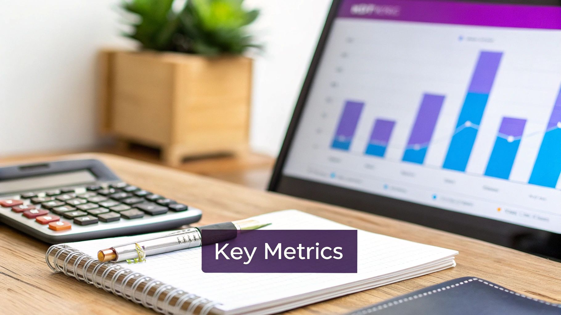
Here’s a peek at a GA4 dashboard showing some key acquisition and engagement metrics.
This high-level view tells you which channels are driving new visitors and, just as importantly, how engaged those visitors are once they arrive.
Channel-Specific Dashboards for Granular Insights
While Google Analytics gives you the 10,000-foot view of website behavior, you need channel-specific dashboards for a ground-level, granular look at campaign performance. These are the native analytics platforms where your ads actually live and breathe.
Platforms like Meta Ads Manager and Google Ads are your daily drivers for optimization. This is where you can geek out on metrics that GA4 can't show you, like ad creative performance, impression share, click-through rates (CTR), and cost per click (CPC). Inside Meta Ads Manager, for instance, you can see exactly which ad image is generating the lowest cost per lead. That’s an insight you can act on immediately.
Pro Tip: Don’t sleep on UTM parameters. They are the critical glue between your channel-specific dashboards and Google Analytics. Without them, all your paid traffic just shows up as "referral" or "direct," which makes it totally impossible to attribute success. For a refresher, check out this in-depth guide on how to use UTM parameters and make sure every single click gets counted correctly.
Connecting Marketing to Sales With a CRM
For any business where the sales cycle is longer than an immediate "buy now" click, a Customer Relationship Management (CRM) system is an absolute must-have. This is especially true for service-based businesses, B2B companies, and anyone with a sales team.
A CRM like HubSpot or Salesforce is what finally connects your marketing efforts to actual sales outcomes. By integrating your lead forms with your CRM, you can track a lead from their very first click on a Facebook ad, through every email they open and every sales call they take, all the way to a closed deal.
This connection is what allows you to calculate a true lead-to-customer conversion rate and finally prove marketing’s direct contribution to the bottom line. No more guessing.
Unifying Your Data With Visualization Tools
Let's face it: jumping between Google Analytics, Meta Ads, and your CRM every day is a massive time sink. It’s also how data silos are born. This is where data visualization tools like Looker Studio (formerly Google Data Studio) or Tableau change the game.
These platforms let you pull data from all your different sources into a single, cohesive dashboard. Imagine creating one master marketing report that shows your ad spend from Google Ads, your website conversions from GA4, and your closed-won deals from your CRM—all in one place.
This unified view becomes your team's ultimate source of truth, enabling faster, smarter decisions without the soul-crushing drudgery of building spreadsheets by hand.
Creating Reports That Inspire Action
Let's be real: raw data in a spreadsheet is just noise. It only becomes useful when you turn it into a clear story that helps your team make smarter decisions. The real work isn't just collecting numbers; it's about crafting compelling reports that stakeholders actually understand, trust, and act on.
Forget those generic, one-size-fits-all templates. Your reporting needs to be as specific as your business goals. A weekly e-commerce report has a completely different job to do than a quarterly executive summary.
Tailoring Reports to Business Needs
The most effective reports are purpose-built for their audience. The metrics a paid media specialist obsesses over are just noise to a CEO. Let’s break down three battle-tested frameworks I’ve seen work for different business models.
- Weekly E-commerce Dashboard: This report is all about speed. You're focused on recent ad spend and its direct impact on sales, right now. Feature metrics like Return on Ad Spend (ROAS) by channel, Cost Per Acquisition (CPA), and crucial on-site behavior like Add-to-Cart Rate and Checkout Abandonment Rate. The goal is to quickly spot which campaigns are profitable and which are bleeding cash so you can make fast budget adjustments.
- Monthly Lead Generation Report: For a professional service firm, the story is less about instant transactions and more about pipeline health. This report should show the entire funnel, from the first click to a closed deal. Your key metrics are Cost Per Lead (CPL), the number of Marketing Qualified Leads (MQLs), and the all-important Lead-to-Customer Conversion Rate. It needs to answer: Are we generating enough leads? Are they the right leads? And how efficiently are we turning them into paying clients?
- Quarterly Executive Summary: This is the high-level view for the C-suite. It strips away all the tactical jargon and connects every marketing dollar directly to revenue and growth. You'll focus on big-picture numbers like Customer Acquisition Cost (CAC), Customer Lifetime Value (LTV), and the LTV:CAC ratio. The narrative here is all about profitability, market share, and marketing's overall contribution to the bottom line.
The Art of Data Visualization
How you present your data is just as important as the data itself. A poorly chosen chart can hide a critical insight, while the right one can make it jump right off the page. The goal is to make your findings instantly digestible.
A report's job is not to present data, but to answer questions. Use visuals to provide the clearest, fastest answers possible, turning complex numbers into an undeniable story of performance.
Here are a few quick tips for telling a clear story with your charts:
- Use line charts to show trends over time (e.g., website traffic over the last 90 days).
- Use bar charts to compare distinct categories (e.g., ROAS across Google, Meta, and LinkedIn).
- Use pie charts sparingly, and only when you’re showing parts of a whole that add up to 100% (e.g., traffic source breakdown).
- Label everything clearly and use color intentionally to draw attention to the most important data points. A splash of red on a declining metric works wonders.
Automating Your Reporting Workflow
Building these reports by hand every week or month is a recipe for burnout and human error. Your time is far more valuable when you're analyzing insights and developing strategy, not manually exporting CSVs and copy-pasting numbers.
This is where automation becomes your secret weapon.
Tools like Looker Studio can connect directly to your various data sources—Google Analytics, ad platforms, your CRM—and pull the latest information into a live, interactive dashboard.
To really dial in your visualizations and track vital customer metrics, exploring a dedicated customer experience dashboard software can consolidate everything into a single, actionable view.
By investing a little time upfront to build an automated dashboard, you create a permanent, reliable source of truth. Stakeholders can access it anytime for real-time updates, freeing you from the repetitive cycle of manual reporting. That means you get to focus on what truly matters—optimization and growth.
Turning Insights Into Campaign Optimizations
Let's get real. A performance report isn't a report card; it's a treasure map. The data is only powerful when it answers one simple question: "What should we do next?" This is where you stop being a data collector and start being a strategist, turning numbers into a roadmap for growth.
Analyzing your campaign data isn't just about seeing what happened. It’s about playing detective to figure out why it happened. You’re hunting for the patterns, the weird outliers, and the hidden opportunities that live inside the numbers.
Adopting the Optimization Cycle
The best marketing teams I've worked with all run on the same simple but ridiculously effective loop: Analyze, Hypothesize, Test, and Implement. This framework turns measurement from a boring, passive chore into an active strategy. It’s a systematic way to make sure your campaigns are always evolving.
This cycle is your defense against random, gut-feeling changes. It forces you to use data to justify every single tweak, which is the difference between guessing what works and knowing what works.
The flow diagram below shows how raw data from day-to-day operations gets refined into the strategic insights that leadership actually cares about.
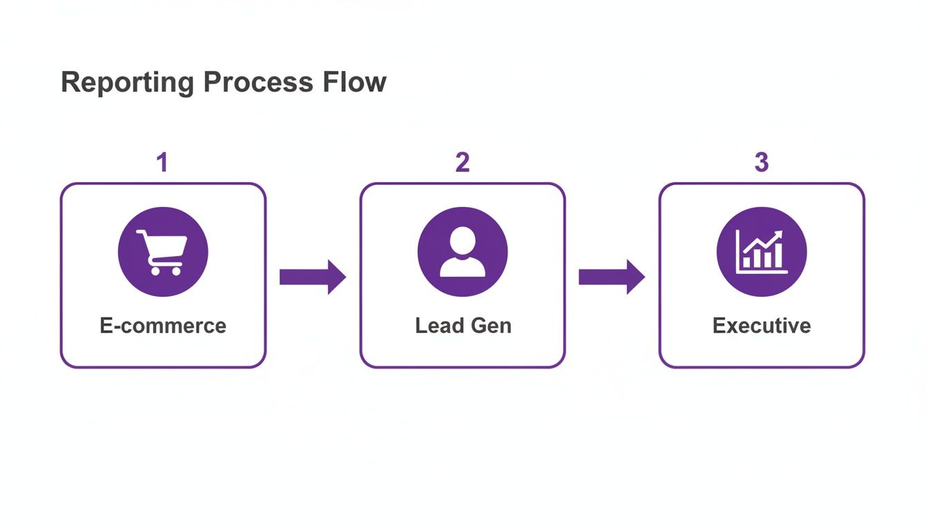
As you can see, the data from your e-commerce platform and lead gen funnels needs to be boiled down into clear, strategic takeaways before it ever hits an executive's desk.
From Analysis to Actionable Hypotheses
Okay, let's make this practical. You're staring at a report that shows your cost per lead (CPL) on a Facebook campaign shot up by 30% in the last two weeks. The analysis is done. Now what?
Instead of panicking, you start asking questions.
- Observation: CPL is rising.
- Hypothesis 1: Ad fatigue. Our audience has seen the same creative a thousand times, and they're officially over it.
- Hypothesis 2: That copy change we made on the landing page last week is tanking our conversion rate, forcing Facebook to spend more to find someone who will convert.
See the difference? These aren't just wild guesses. They are specific, data-informed ideas that you can now go and test methodically.
The goal of analysis isn't to find one single "right" answer. It's to generate a handful of smart, testable hypotheses that give you a clear path forward for your next experiment.
Running Smart Experiments
With your hypotheses ready, it’s time to design an experiment. The golden rule here is to test one variable at a time. If you change five things at once, you’ll have no idea what actually caused the results. A/B testing is your best friend.
- For Hypothesis 1 (Ad Fatigue): You’d launch an A/B test. Run your tired old creative against a fresh set of ad images or videos, but keep the audience and budget exactly the same. After a week, you'll have a clear winner based on CPL.
- For Hypothesis 2 (Landing Page): You'd use a tool like Google Optimize or Unbounce to run a split test. Send 50% of your ad traffic to the old landing page and 50% to the new one. The page that gets the higher conversion rate wins. Simple.
This disciplined approach takes the emotion and guesswork out of the equation. Take social media, for example. We know it's a beast for marketers—research shows 79% of them worldwide find it extremely or very effective. By testing something as simple as user-generated content in their Instagram ads, some brands have seen conversion rates jump by 4.5%. This just proves that the right creative, backed by a solid test, can make a massive impact. (Find more digital marketing stats from Statista).
Implementing and Scaling Your Wins
Once your experiment gives you a clear winner, the final step is to act on it and scale your success. If that new ad creative cuts your CPL by 20%, you don't just give yourself a high-five. You immediately pause the underperforming ads and shift that budget over to the new winner.
This cycle never really ends, and that's the beauty of it. Yesterday’s winning ad will eventually become today's fatigued creative. Your newly optimized landing page will become the control group for your next experiment. This continuous loop of measuring, analyzing, and testing is the true heart of effective marketing. It ensures every dollar you spend is working harder than the last, creating small, incremental gains that lead to massive long-term growth.
Your Burning Measurement Questions, Answered
Alright, let's get into the weeds. Moving from a high-level marketing plan to the nitty-gritty of campaign measurement is where the real questions pop up. It’s one thing to talk strategy, but another to stare at a dashboard wondering what it all means.
We hear the same questions time and time again from businesses trying to connect the dots. Think of this as your field guide for those "wait, how do I actually..." moments that every marketer runs into. No fluff, just straight answers to help you measure with confidence.
How Often Should I Be Checking My Campaign Performance?
This is a classic. The honest answer? It completely depends on the channel and the speed of your campaign. Drowning yourself in data every hour is just as unproductive as checking in once a month. You need a rhythm that fits the medium.
- Daily Gut Checks (5-10 Minutes): If you're running fast-moving paid campaigns on platforms like Meta or Google Ads, a quick daily peek is non-negotiable. You’re not doing a deep analysis here; you're just scanning for red flags. Is your cost-per-click suddenly through the roof? Did a top-performing ad get disapproved overnight? This is all about preventing budget-burning disasters.
- Weekly Deep Dives (1-2 Hours): This is where the real magic happens for your paid campaigns. A weekly review gives you enough data to spot real patterns without getting lost in daily fluctuations. It's the perfect cadence for analyzing creative performance, checking ROAS trends, and making smart optimizations that actually move the needle.
- Monthly Reviews: For the slow-burn channels like SEO and content marketing, a monthly check-in is your sweet spot. These efforts build momentum over time, so looking at them daily or even weekly is a recipe for anxiety. A monthly report gives you a clear, realistic picture of your progress in organic traffic, keyword rankings, and content engagement.
What Is a "Good" Return on Ad Spend (ROAS)?
Ah, the million-dollar question. And the only real answer is: it depends. There's no magic number for a "good" ROAS that applies to everyone. A figure that’s amazing for one business could be a total disaster for another. It all comes down to your profit margins.
You’ll often hear a 4:1 ratio thrown around—that’s $4 in revenue for every $1 you spend. But let's get real. An e-commerce store selling low-margin t-shirts might need an 8:1 ROAS just to cover the cost of goods, shipping, and overhead. On the flip side, a high-margin SaaS company could be swimming in profit with a 3:1 ROAS.
The key is to work backward. Calculate your break-even ROAS first. Figure out your actual profit on a sale, and that tells you the absolute minimum return you need to stay afloat. Anything above that number is profit, and that is what you can call "good."
How Can I Actually Measure My Offline Marketing?
Tracking offline campaigns—think radio ads, direct mail, or event sponsorships—feels like a black box, but it doesn't have to be. The trick is to build a digital bridge that connects the real-world interaction to your online analytics.
Here are a few proven ways to do it:
Unique Vanity URLs: Slap a simple, memorable URL on your print materials (e.g., YourBrand.com/Save). Redirect that URL to a landing page with UTM parameters baked in. Boom—you can now isolate and track every visitor who came from that specific offline source.
Dedicated QR Codes: Place a unique QR code on your event banner or direct mail flyer. When someone scans it, they're whisked away to a specific landing page, effectively tagging them as coming from that exact campaign.
Call Tracking Numbers: Use a service that provides a unique phone number for each offline channel. When a lead calls the number from your radio spot, the system attributes it directly back to that ad, giving you crystal-clear credit for phone conversions.
Which Attribution Model Should I Use?
Choosing an attribution model feels complicated, but it's all about matching it to your customer's journey. Most platforms default to last-click attribution, which gives 100% of the credit to the final touchpoint before a conversion. It's simple, but it’s often wrong, completely ignoring the channels that introduced your brand to the customer in the first place.
If your sales cycle is longer than a few minutes, you need to explore other models in Google Analytics.
For instance, the Time Decay model gives more credit to touchpoints closer to the sale but still throws a bone to earlier interactions. The Linear model is the diplomat, spreading credit evenly across every touchpoint in the journey.
There's no single "best" model for everyone. A good starting point is to toggle between different models in GA4 and see how the credit shifts. The one that most closely mirrors how your customers actually find and engage with you is the right one for your business. It gives you a more balanced view so you don't accidentally slash the budget for a top-of-funnel channel that’s quietly setting up all your future sales.
At Rebus, we turn complex data into clear, actionable strategies that actually drive growth. If you're ready to stop guessing and start building a predictable marketing machine, we should talk. Partner with us to supercharge your marketing and get results you can measure.