
10 Website Design Best Practices for 2025
Your website is more than just a digital brochure; it's your most powerful sales tool, brand ambassador, and customer service hub. Exceptional design isn't a luxury-it's the critical foundation for business success. The difference between a thriving online presence and a failing one often comes down to adhering to proven website design best practices. These principles govern everything from a user's first impression to their final click to purchase.
A poorly designed site leads to high bounce rates, lost trust, and missed revenue, while a strategically designed site captivates, engages, and converts. First impressions are formed in milliseconds, and if your user experience is confusing or slow, potential customers will simply leave. This reality makes understanding and implementing effective design non-negotiable for anyone serious about digital growth, from startups building a brand to established e-commerce retailers optimizing sales.
In this comprehensive guide, we'll break down the 10 most crucial website design best practices you need to master. We will provide actionable insights, real-world examples, and expert tips to help you build a website that not only looks stunning but also drives tangible business results. To gain a broader perspective on the most critical strategies for an effective online presence, consider this guide to the top website design best practices for 2025 for additional context. Whether you're launching a new site or revitalizing an existing one, these core principles will serve as your roadmap to creating a high-performing digital asset that supports your business goals.
1. Mobile-First Responsive Design
Mobile-first responsive design is no longer just an option; it's a foundational website design best practice. This approach reverses the traditional design workflow by prioritizing the mobile user experience first. Instead of designing for a large desktop screen and then trying to condense content for smaller devices, you begin with the most constrained view (a mobile phone) and progressively enhance the layout for tablets, laptops, and desktops.
This strategy forces a focus on what's truly essential. By starting small, you make critical decisions about content hierarchy and core functionality upfront, ensuring a streamlined and efficient experience for the majority of users. This is crucial, as mobile browsing has definitively surpassed desktop usage.
Why Mobile-First Matters
The primary benefit is an improved user experience for the largest segment of your audience. A site built for mobile is inherently faster, more focused, and easier to navigate on a small screen. This approach directly aligns with Google's mobile-first indexing policy, meaning the mobile version of your site is the baseline for how Google determines rankings, making it critical for SEO.
The bar chart below illustrates the clear dominance of mobile devices in global web traffic, underscoring why this strategy is so vital.
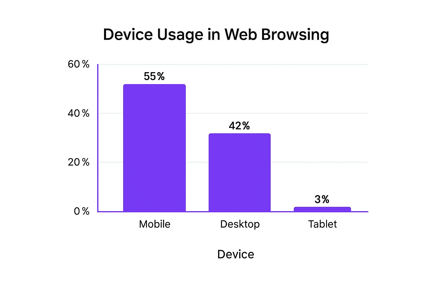
This data reveals that by not prioritizing mobile, you are effectively providing a suboptimal experience for over half of your potential visitors.
Actionable Implementation Tips
- Design for the Smallest Viewport: Begin your design process with a screen width of 320px to address the most constrained environment first.
- Prioritize Content Ruthlessly: On a small screen, you must decide what content is most important. This forces clarity and focus that benefits users on all devices.
- Consider Thumb Zones: Place primary navigation and interactive elements like buttons within easy reach of a user's thumb for better usability.
- Use Relative Units: Implement CSS with relative units like percentages (%), ems, or rems instead of fixed pixels to allow for fluid scaling across different screen sizes.
2. Fast Page Load Speed and Performance Optimization
Fast page load speed is a non-negotiable component of modern website design best practices. It refers to the time it takes for a webpage to fully display its content, and performance optimization involves the techniques used to minimize this delay. In an era of shrinking attention spans, even a one-second delay can be the difference between a conversion and a lost customer.
This focus on speed directly impacts user satisfaction, search engine rankings, and your bottom line. Major studies have consistently shown a direct correlation between faster load times and higher engagement. For instance, data reveals that 53% of mobile users will abandon a site if it takes longer than three seconds to load, making performance a critical usability and business metric.
Why Page Speed Matters
The primary benefit is a drastically improved user experience, which leads to lower bounce rates and higher conversion rates. For example, Walmart discovered that for every one-second improvement in load time, their conversions increased by 2%. Similarly, the BBC found they lost an additional 10% of users for every extra second their site took to load.
Beyond user satisfaction, page speed is a confirmed ranking factor for Google. A faster site is more likely to rank higher in search results, driving more organic traffic. This optimization directly addresses how users perceive your brand; a slow site feels unprofessional and untrustworthy, while a fast site signals efficiency and reliability. For more insights on keeping visitors engaged, learn how to reduce your bounce rate on rebusadvertising.com.
Actionable Implementation Tips
- Audit Your Performance: Use free tools like Google PageSpeed Insights, Lighthouse, or GTmetrix to analyze your site's current speed and receive specific recommendations for improvement.
- Optimize Images: Compress images using modern formats like WebP. Ensure no single image is excessively large, aiming for under 200KB for key visuals.
- Implement Caching and a CDN: Use browser caching to store static assets locally for returning visitors. A Content Delivery Network (CDN) serves assets from servers geographically closer to the user, significantly reducing latency.
- Minimize Code: Minify your CSS, JavaScript, and HTML files to remove unnecessary characters without affecting functionality. Defer the loading of non-critical JavaScript to prioritize rendering visible content first.
3. Clear and Intuitive Navigation Structure
A clear and intuitive navigation structure is the roadmap that guides users through your website. It is the organizational framework and menu system that allows visitors to find information, understand their location within the site's hierarchy, and complete desired actions with minimal friction. If users can't find what they're looking for quickly, they won't hesitate to leave, making logical navigation a cornerstone of effective website design best practices.
This principle, championed by usability experts like Steve Krug, is built on the idea that a user should never have to think hard about how to get from one point to another. The goal is to create a seamless journey that feels effortless.
Why Intuitive Navigation Matters
The primary benefit is a drastic reduction in user frustration and bounce rates. When navigation is intuitive, users feel more in control and confident, leading to longer session durations and higher engagement. This positive user experience directly impacts conversion rates, as visitors can easily find products, services, or contact information.
For example, Apple's website features a famously simple top navigation with clear product categories, guiding users effortlessly. Similarly, the GOV.UK site uses task-based navigation that focuses entirely on user needs, such as "Renew your passport," rather than confusing governmental department structures. This user-centric approach ensures efficiency and satisfaction.
Actionable Implementation Tips
- Use Familiar Conventions: Place your primary navigation in expected locations, such as the top header or a left-hand sidebar, as this is where users are conditioned to look.
- Keep it Simple: Limit the number of main menu items to avoid overwhelming users. Dropbox famously improved conversions by simplifying their primary navigation from seven items to just four.
- Implement a Sticky Menu: For pages that require scrolling, a "sticky" or fixed navigation bar keeps key links accessible at all times, preventing users from having to scroll back to the top.
- Make Your Logo a Homepage Link: This is a universally understood convention that provides a reliable way for users to return to their starting point from anywhere on your site.
- Test Your Structure: Use methods like card sorting to understand how your users group information and conduct usability testing to observe where they struggle. Analytics can also reveal navigation pain points.
4. Accessible and Inclusive Design (WCAG Compliance)
Web accessibility is a critical website design best practice that ensures people with diverse disabilities can perceive, understand, navigate, and interact with the web. This means designing for visual, auditory, motor, and cognitive impairments. Adhering to the Web Content Accessibility Guidelines (WCAG) creates an inclusive experience for the significant portion of the global population with disabilities and often improves overall site usability for everyone.
This approach involves consciously removing barriers that could prevent access or interaction. It’s not just an ethical consideration; in many regions, it is a legal requirement. Cases like the Domino's Pizza Supreme Court ruling have established that commercial websites are places of public accommodation and must be accessible under the Americans with Disabilities Act (ADA).
Why Accessibility Matters
The primary benefit is creating an equitable experience, opening your website to a wider audience. Accessible design principles often lead to a better user experience for all, such as improved readability from high-contrast text and clear navigation structures that help everyone. Prioritizing accessibility also protects your business from potential legal action and strengthens your brand's reputation as a socially responsible organization.
For example, GOV.UK is a benchmark for digital public services, meeting the highest WCAG standards (AAA) to ensure all citizens can access vital information. This commitment demonstrates that accessibility is achievable and beneficial at a large scale.
Actionable Implementation Tips
- Use Semantic HTML: Structure content with proper HTML5 elements like <header>, <nav>, and <main> instead of relying solely on <div> tags. This provides essential context for screen readers.
- Provide Text Alternatives: Ensure all images and other non-text content have descriptive alt text so users with visual impairments understand their purpose.
- Ensure Keyboard Navigability: Test your entire site to confirm every interactive element, from links to form fields, can be accessed and operated using only the Tab key.
- Check Color Contrast: Use tools to verify that text and background colors meet WCAG contrast ratio requirements, making content readable for users with low vision or color blindness.
- Label All Form Inputs: Connect every form field with a corresponding <label> to make it clear what information is required, which is vital for users of assistive technologies.
5. Strategic Use of White Space and Visual Hierarchy
Strategic use of white space, often called negative space, is one of the most powerful yet misunderstood website design best practices. It refers to the unmarked areas between elements like text, images, and buttons. When paired with a strong visual hierarchy, which organizes content by importance, it guides the user's eye, reduces cognitive load, and creates a more professional, uncluttered aesthetic.
This approach isn't about creating empty pages; it's about providing breathing room. By intentionally managing space, you create focus and direct attention to the most important content, such as calls-to-action or key value propositions. Luxury brands like Apple master this, using expansive white space on product pages to convey sophistication and focus the user’s attention entirely on the product.
Why White Space and Hierarchy Matter
The primary benefit is improved user comprehension and focus. A well-spaced layout is easier to scan, and a clear visual hierarchy tells users what to look at first, second, and third. This dramatically enhances readability and makes complex information digestible. For example, Dropbox famously increased conversions after a 2017 redesign that embraced more white space and a cleaner layout, proving that less clutter can directly impact business goals.
Ultimately, a deliberate use of space and hierarchy signals professionalism and builds trust. It makes a website feel intentional and user-centric, contributing to a premium user experience that keeps visitors engaged and encourages them to take action.
Actionable Implementation Tips
- Establish a Spacing System: Use a consistent scale (e.g., 8, 16, 24, 32, 48px) for margins and padding to create a predictable visual rhythm throughout your site.
- Increase Line Height: Set body text line-height to 1.5x or 1.6x the font size. This simple change significantly improves readability, especially for long-form content.
- Isolate Key Elements: Create larger margins around critical elements like "Buy Now" buttons or sign-up forms to make them stand out and draw the user's eye.
- Use Proximity to Group Content: Place related items close together and use white space to separate them from unrelated groups. This is a fundamental principle of visual organization.
6. Strong and Consistent Visual Branding
Strong and consistent visual branding is a critical website design best practice that involves the uniform application of colors, typography, imagery, and design elements across every page of your site. This consistency transforms a simple website into a memorable brand experience, fostering recognition and building trust with your audience. A cohesive visual identity makes your brand look more professional and reliable, which can significantly impact user perception and loyalty.
This strategic approach ensures that every user interaction reinforces your brand identity. From the homepage to the contact form, a consistent visual language creates a seamless journey that feels intentional and well-crafted. This is a cornerstone of building a strong digital presence that resonates with visitors and distinguishes you from competitors.

Why Consistent Branding Matters
The primary benefit is building brand equity and recall. When users see consistent visuals, like Coca-Cola's iconic red or Spotify's distinct green and black palette, they instantly recognize the brand. This familiarity breeds trust and can lead to higher engagement and conversion rates. Studies have shown that consistent brand presentation can increase revenue by reinforcing the brand’s positioning in the minds of consumers. For an in-depth guide on establishing this, explore these brand positioning statement examples.
Furthermore, consistency simplifies the user experience. Predictable patterns in layout, button styles, and typography reduce cognitive load, allowing users to navigate your site more intuitively and focus on the content. A well-defined system, like Airbnb’s Design Language System (DLS), ensures every new feature feels like a natural part of the platform.
Actionable Implementation Tips
- Create a Style Guide: Document your brand's color palette (3-5 primary colors), typography (2-3 font families), logo usage, and imagery guidelines.
- Limit Your Fonts and Colors: Stick to a small, defined set of fonts and colors to maintain a clean and professional look. Use one font for headings and another for body text.
- Build a Reusable Component Library: Develop a set of reusable UI elements like buttons, forms, and cards. This ensures consistency and speeds up the development process.
- Conduct Regular Brand Audits: Periodically review your entire website to identify and correct any inconsistencies that may have appeared over time.
7. Prominent and Clear Call-to-Action (CTA) Design
A Call-to-Action (CTA) is arguably the most important element on any page of your website. These are the buttons, links, or other interactive components designed to guide users toward a specific, valuable action, such as making a purchase, signing up for a newsletter, or downloading a resource. Effective CTA design is a core tenet of website design best practices, as it directly bridges the gap between user interest and business conversion.
This practice involves a deliberate combination of persuasive copy, strategic placement, and compelling visual design. The goal is to make the desired action stand out, feel intuitive, and communicate a clear benefit to the user. A well-crafted CTA removes ambiguity and friction, telling visitors exactly what to do next and why they should do it. For example, Netflix’s iconic red "Join Free for a Month" button is a masterclass in contrast and value proposition.
Why Prominent CTAs Matter
The primary purpose of a website is to drive action, and CTAs are the mechanism for doing so. A vague, hidden, or unappealing CTA will result in missed opportunities and a low conversion rate. Conversely, a clear and prominent CTA can significantly boost user engagement and goal completions. It acts as a signpost, guiding users through your conversion funnel and preventing them from abandoning their journey.
By focusing on CTA optimization, you directly impact your bottom line. Even minor changes in wording, color, or placement can lead to substantial increases in leads and sales. For a deeper understanding of this crucial element, you can learn more about how to improve website conversion rates at Rebus Advertising.
Actionable Implementation Tips
- Use Action-Oriented, First-Person Copy: Instead of a generic "Submit," use more specific, value-driven language like "Get My Free Guide" or "Start My 30-Day Trial." First-person phrasing often connects better with users.
- Create Strong Visual Contrast: Your CTA button should stand out from the rest of the page. Use a color that contrasts with the background but still aligns with your brand palette.
- Strategic Placement is Key: Place primary CTAs "above the fold" where users can see them without scrolling. It's also effective to repeat the CTA at natural decision-making points further down the page.
- Leverage Whitespace: Surround your CTA with ample negative space to make it pop and draw the user's eye directly to it.
- A/B Test Everything: Continuously test different versions of your CTA's copy, color, size, and placement to identify what resonates most with your audience.
8. Security and Trust Signals
Security and trust signals are crucial visual and functional elements that communicate a website's legitimacy, security, and credibility to visitors. In an era of heightened awareness around data privacy and cyber threats, users are more cautious than ever. These signals work to reduce friction and user anxiety by providing explicit and implicit assurances that their information and interactions are safe.
This practice is fundamental because trust is the currency of the web. Without it, visitors will hesitate to provide personal information, make a purchase, or engage with your brand. Implementing these signals is a non-negotiable aspect of modern website design best practices, directly impacting user confidence and conversion rates. Research shows that a significant majority of users will abandon a transaction if they perceive a site as insecure.
Why Security and Trust Signals Matter
The primary benefit is building immediate credibility and reducing bounce rates. When users see familiar security badges, an SSL certificate (the padlock icon), and clear privacy policies, their subconscious fears are eased. This fosters a sense of safety, encouraging them to proceed with actions like signing up for a newsletter or completing a checkout.
For e-commerce and lead generation sites, this is paramount. Signals like customer reviews, satisfaction guarantees, and transparent contact information directly address common user objections. For example, Amazon masterfully combines secure payment icons with customer reviews and clear return policies to build an unparalleled foundation of trust that facilitates millions of transactions.
Actionable Implementation Tips
- Install an SSL Certificate: This is essential, not optional. The "https://" and padlock icon in the browser bar are the first and most critical trust signals.
- Display Security Badges: Place logos from services like Norton, McAfee, or PCI compliance badges near forms and checkout pages to reassure users at critical moments.
- Showcase Social Proof: Integrate real customer reviews and testimonials, ideally with photos or verified purchase badges, to demonstrate credibility.
- Be Transparent: Clearly display a physical address, phone number, and links to your privacy policy and terms of service in the website footer.
- Use Trust-Building Microcopy: Incorporate small text snippets near forms, such as "Your data is encrypted and secure" or "We will never share your email."
9. Readable and Scannable Content Formatting
Content formatting is the strategic presentation of text on a web page to enhance readability and user engagement. It's a critical website design best practice because most users don't read online content word-for-word; they scan. Research from the Nielsen Norman Group shows that 79% of web users scan any new page they come across. Effective formatting guides the user's eye to the most important information quickly.
This approach involves using structural elements like headings, short paragraphs, lists, and bold text to create a clear visual hierarchy. By breaking up dense blocks of text, you make your content less intimidating and easier to digest. This not only improves comprehension and retention but also significantly reduces bounce rates by keeping visitors engaged for longer periods.
Why Scannable Content Matters
The primary benefit is a vastly improved user experience. When users can find the information they need without friction, they are more likely to stay on your site, trust your brand, and take desired actions. Well-formatted content that is easy to scan can improve comprehension by up to 47%.
Furthermore, search engines favor content that provides a good user experience. Metrics like time on page and bounce rate are indirect ranking signals. Pages that are easy to read and navigate are more likely to perform well in search results. A great example of this in practice is the Buffer blog, which uses clear headings, concise paragraphs, and ample white space to make its marketing advice highly accessible and scannable.
Actionable Implementation Tips
- Use Descriptive Headings: Structure your content with clear H2s and H3s that communicate the main point of each section, allowing users to jump to relevant parts.
- Keep Paragraphs Short: Limit paragraphs to a maximum of 2-4 sentences to avoid overwhelming walls of text and create visual breathing room.
- Employ Bulleted and Numbered Lists: Use lists for three or more related items. They are inherently scannable and break up long narrative passages effectively.
- Bold Key Phrases: Sparingly use bold text to draw attention to crucial words or phrases, but avoid bolding entire sentences as it diminishes the effect.
- Increase Line Spacing: Set your CSS line-height property to between 1.5 and 1.6 to improve readability and reduce eye strain for users.
10. User-Centered Forms with Minimal Friction
User-centered form design is a crucial website design best practice that focuses on making data collection as seamless and intuitive as possible for the user. Forms are often the final, critical step in a conversion funnel, yet the average form has a staggering abandonment rate. The core principle is to reduce cognitive load and remove every unnecessary obstacle between the user and the "submit" button.
This approach involves simplifying layouts, clarifying instructions, and providing real-time feedback to guide users effortlessly through the process. Instead of creating a long, intimidating list of questions, user-centered design breaks the task into manageable pieces, validates information as it's entered, and only asks for what is absolutely essential. The goal is to make filling out a form feel less like a chore and more like a simple, guided conversation.
Why User-Centered Forms Matter
The primary benefit is a direct and significant increase in conversion rates. By minimizing friction, you prevent user frustration and reduce abandonment at the most critical point of interaction. For example, Expedia famously increased its annual profit by $12 million simply by removing one non-essential field from a form. Similarly, companies like Typeform have shown that their conversational, one-question-at-a-time format can achieve completion rates 3.5 times higher than traditional forms.
This practice builds user trust and satisfaction. A well-designed form feels respectful of the user's time and effort, contributing positively to their overall perception of your brand. This is a key component of effective website design best practices, as it turns a potential point of friction into a smooth and reassuring experience.
Actionable Implementation Tips
- Conduct a Field Audit: Ruthlessly evaluate every form field. If you can live without the information, remove the field.
- Use a Single-Column Layout: Research consistently shows that single-column forms are completed faster and with less confusion than multi-column layouts.
- Place Labels Above Fields: Avoid placing labels inside the input field as placeholder text, which disappears once the user starts typing and can cause confusion.
- Implement Inline Validation: Provide real-time feedback as users type, showing a green checkmark for correct entries and a clear error message explaining how to fix mistakes immediately.
- Break Long Forms into Steps: For complex forms, use a multi-step process with a clear progress bar. TurboTax excels at this, turning a daunting task into simple, guided questions.
- Offer Social Login: Reduce signup friction by allowing users to register or log in using existing Google, Facebook, or Apple accounts.
Website Design Best Practices Comparison
| Mobile-First Responsive Design | Moderate; needs multi-device testing and scaling from small screens 🔄🔄 | Moderate; requires flexible CSS, testing on devices ⚡ | Consistent UX across devices, improved SEO, future-proof design 📊 | Websites needing broad device compatibility, SEO focus 💡 | Better mobile performance, SEO boost, streamlined dev ⭐ |
|---|---|---|---|---|---|
| Fast Page Load Speed & Performance Optimization | High; involves ongoing monitoring, infrastructure upgrades 🔄🔄🔄 | High; CDN, image optimization tools, server tuning ⚡ | Faster load times, higher conversions, reduced bounce 📊 | Sites prioritizing speed for SEO, conversions, mobile users 💡 | Improved UX, SEO, lower server costs ⭐ |
| Clear and Intuitive Navigation Structure | Moderate; ongoing updates, balancing simplicity vs complexity 🔄🔄 | Moderate; UX design, user testing ⚡ | Increased user satisfaction, reduced bounce, better SEO 📊 | Content-rich sites, e-commerce, large portals 💡 | Easier content discovery, higher conversions ⭐ |
| Accessible and Inclusive Design (WCAG Compliance) | High; specialized knowledge and testing required 🔄🔄🔄 | Moderate to high; accessibility tools, audits ⚡ | Legal compliance, broader audience reach, improved SEO 📊 | Public, government, and enterprise sites requiring compliance 💡 | Inclusivity, legal safety, enhanced UX ⭐ |
| Strategic Use of White Space & Visual Hierarchy | Low to moderate; design-focused but requires thoughtful layout 🔄 | Low; design resources, prototyping ⚡ | Improved readability, professional look, better user focus 📊 | Branding-focused, content-heavy, luxury/product sites 💡 | Better comprehension, reduced cognitive load ⭐ |
| Strong and Consistent Visual Branding | Moderate; requires brand development and design system governance 🔄🔄 | Moderate; tools for design system, training ⚡ | Increased brand recognition, trust, seamless UX 📊 | All brand-driven websites, multi-team environments 💡 | Cohesive identity, faster dev, emotional connection ⭐ |
| Prominent and Clear Call-to-Action (CTA) Design | Moderate; requires testing and optimization cycles 🔄🔄 | Low to moderate; design and A/B testing tools ⚡ | Higher conversions, clear user direction 📊 | Landing pages, marketing sites, e-commerce 💡 | Dramatic conversion lift, user guidance ⭐ |
| Security and Trust Signals | Moderate; setup of SSL, badges, ongoing maintenance 🔄🔄 | Moderate to high; SSL costs, security services ⚡ | Higher conversions, reduced abandonment, legal compliance 📊 | E-commerce, financial services, any site handling sensitive data 💡 | Increased trust, better SEO, legal safety ⭐ |
| Readable and Scannable Content Formatting | Low to moderate; editorial effort plus UX best practices 🔄 | Low; content creation and formatting ⚡ | Improved comprehension, longer engagement, SEO gains 📊 | Blogs, news sites, educational content, SaaS 💡 | Better retention, easier scanning, accessibility ⭐ |
| User-Centered Forms with Minimal Friction | Moderate; requires UX research, validation, optimization 🔄🔄 | Moderate; development of validation, analytics ⚡ | Higher form completion, better data quality, user satisfaction 📊 | Signup, checkout, lead capture forms 💡 | Reduced abandonment, clearer process, improved conversions ⭐ |
Turn Your Website Into a Growth Engine
Navigating the landscape of modern digital marketing can feel complex, but the journey to an exceptional online presence begins with a solid foundation. Throughout this guide, we've explored the ten pillars that uphold a truly effective website. These are not merely suggestions on a checklist; they are the fundamental principles that separate a static online brochure from a dynamic, high-performing growth engine for your business. Mastering these website design best practices is about adopting a philosophy of user-centricity, where every pixel, every line of code, and every piece of content serves a distinct purpose: to create a seamless, intuitive, and valuable experience for your audience.
We began with the non-negotiable duo of mobile-first responsive design and blazing-fast page load speeds. These two pillars ensure your site is accessible and enjoyable for every user, regardless of their device or connection speed. We then moved into the architecture of a great user experience, covering clear navigation, the strategic use of white space, and the creation of a powerful visual hierarchy. These elements work in concert to guide visitors effortlessly toward their goals, preventing confusion and building confidence in your brand.
From Good Design to Great Results
The difference between a good website and a great one often lies in the details that build trust and drive action. Implementing accessible and inclusive design (WCAG) standards doesn't just broaden your audience; it sends a powerful message that you value every visitor. This commitment to user well-being is reinforced by prominent security and trust signals, which are critical for converting skeptical prospects into loyal customers.
Ultimately, your website's success hinges on its ability to communicate effectively and persuade users to act. This is where strong branding, readable content, and frictionless forms come into play. A consistent visual identity makes your brand memorable, while scannable text makes your message digestible. When the moment comes for a user to convert, a user-centered form design ensures the final step is as simple and painless as possible, directly impacting your bottom line.
Your Actionable Path Forward
The principles we've discussed are interconnected. A fast, mobile-friendly site with clear CTAs will always outperform a slow, confusing one. A visually appealing design that lacks clear navigation will fail to retain visitors. The true power of these website design best practices is realized when they are implemented holistically, creating a cohesive digital experience that works tirelessly to achieve your business objectives.
Your next steps should be strategic and data-driven:
- Audit Your Current Website: Use this list as your guide. Where are the biggest gaps? Start with the high-impact areas like mobile performance and CTA clarity.
- Prioritize User Feedback: Don't guess what your users want. Use tools like heatmaps, session recordings, and user surveys to gather real-world insights.
- Commit to Iteration: Great design is not a one-time project. It's an ongoing process of testing, learning, and optimizing based on user behavior and performance data.
By embracing this user-first approach, you transform your website from a simple digital asset into your most powerful marketing tool. You create an environment that not only attracts visitors but also engages them, builds lasting trust, and consistently drives conversions, fueling sustainable growth for your brand.
Ready to transform these principles into a powerful reality for your business? The expert team at Rebus has over 14 years of experience crafting visually stunning, high-performing websites that are built to convert. Let us help you implement these website design best practices to create a digital experience that captivates your audience and drives measurable results.